5 Key Elements of a High-Converting Facebook Ads’ Landing Page
Learn how to improve the conversion rates of your landing pages for Facebook ads and promoted social media posts.
Have you ever a created a landing page for your Facebook ads or promoted social media posts to capture leads, drive resource downloads, or get sign-ups for your service? If so, would you like to improve the conversion rates of those landing pages? Of course you would! The primary goal of any landing page is to collect valuable information that allows you to market to, and communicate with, potential leads. That said, after someone clicks on your Facebook ad (or promoted tweet or pin, for that matter), the copy and design of the landing page you direct them to are instrumental in the process of collecting leads. In this article, you’ll learn five key copy and design elements of a high-converting landing pages -- for Facebook ads and promoted social media posts.
1. Goal-Driven Copy Length
The first element of your landing page you need to decide on is the length of your copy.When a person is directed to your landing page from your Facebook ad, tweet or pin, you have less than 10 seconds to grab your visitor’s attention and get them to convert. “Convert” could mean to purchase your product/service, download your resource, register for your webinar, make an appointment, etc. Depending on what your goals are for your ad or post, you will either design a landing page that has a little bit or a lot of copy. Shorter copy is typically best used to meet an immediate goal. For example, you want to capture email addresses so you can email subscribers access to an exclusive, limited- time-only sale, or you want to get sign ups for a free webinar you’re having soon or downloads of an eBook you created. The idea is that when people arrive at your landing page the messaging is short and sweet and they know exactly the action you want them to take, now.Landing pages with more detailed, scrollable copy are best reserved for times you have long-terms goals. Let’s say you want to create awareness for a new product or to educate your audience about a problem and a solution your brand provides. In these cases, long-copy landing pages can help your brand establish trust and credibility with those who click on your ad.
Short-copy landing pages are best used when the purpose of your Facebook ads is to promote resources, newsletters and online events.
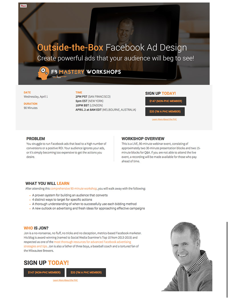
Long-copy landing pages are best used when the purpose of your Facebook ads is to educate your audience and/or create awareness for a solution your brand provides. One warning: When it comes to longer landing pages, don’t expect to see too many hard conversions immediately. When you’re focusing on a long-term goal, your conversions often come in later. Instead, look at time on page as a success metric. If people are arriving at your Facebook ads’ landing page and not immediately leaving, this is a good sign your landing page is performing well.
2. Limited Form Fields
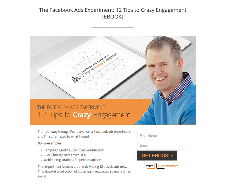
The amount of data you want to collect from your ads’ landing page visitors can affect your conversion rate. Ask for too much information and you could turn people away. Especially if your incentive, i.e., what you’re giving away in return, does not feel worthy of the information you’re asking your visitors to share. Here’s a tip to keep in mind: Keep your landing page’s form fields to a minimum. Why? Your conversion rate goes down as your number of entry fields required increases, according to an infographic published by QuickSprout. When a form has only three fields, its conversion rate is 25 percent. Double the number of form fields and the conversion rate drops to 15 percent.
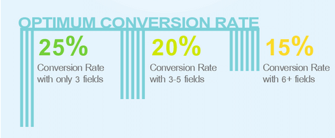
The number of form fields you have can affect the conversion rates of your Facebook ads.
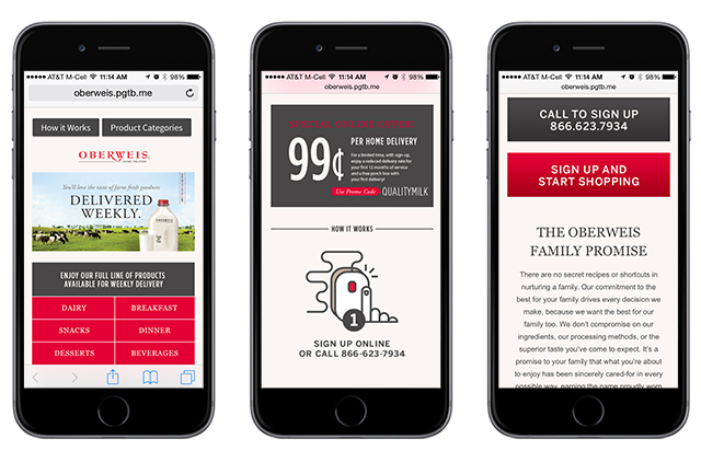
3. Key Visuals
The use of visuals on your ads and promoted posts’ landing pages can help quickly communicate messages more effectively than text-only landing pages.
Here are three reasons this may be:
1. Our brains process images and their meanings more quickly than they do plain text.
This makes sense, as 50 percent of the brain is involved in visual processing and 65 percent of people are visual learners.
2. Visual elements allow you to design a landing page that flows nicely.
People have a limited time to spend on your landing page, and they -- we! -- are all easily distracted. Just look at how many tabs are open on your smartphone or desktop right now….all thnewse pages competing for attention. To help get the point of your landing page across quickly, use graphics and images to break up the page to make its content easily digestible. The last thing you want is for your landing page’s visitors to be faced with unappealing, like dense blocks of texts — this will surely lead to high bounce rates and low conversions. Let me repeat: Don’t neglect flow!
3. Visuals have the power to deliver emotional cues and messages to your landing page visitors, without the use of additional copy.
For example, if you a have bold red call to action button, this sends a strong signal to visitors that they should take action quickly. Whereas, if your key visuals are primarily blue, the subconscious message is friendlier, more soothing. People respond positively to well-designed landing pages. Use images and graphics wisely to make your landing page visually appealing and you’ll reduce your bounce rate, improve visitor retention and help increase conversions. Are you curious about what a visually appealing landing page looks like? Here’s an example from the payment company Square. The background visual they chose is bold, clean, and most important, shows off their product’s functionality.
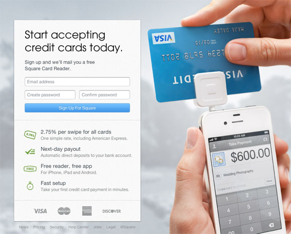
For your Facebook ads’ landing page, choose visuals that reflect your brand’s asthenic and help draw people in, rather than overwhelm the eye.
4. Responsive, i.e., “Mobile-ready,” Design
Every quarter, Facebook's mobile usage has increased. So where are we now? As of March of 2015, there were 798 million (!) mobile daily active users, according to Facebook’s 2015 Q1 report.
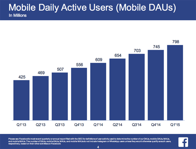
Consider Facebook’s mobile users when you design your Facebook ads’ landing page.What’s more, of Facebook’s 1.44 billion monthly active users, a whopping 40 percent of them use the social network on mobile devices only. (As for Twitter, 80 percent of its users are on mobile!)Simple mobile usage all around is higher, it’s important that you design your landing pages with mobile in mind.There’s nothing worse than when a mobile user clicks on a promoted post or a Facebook ad in their news feed only to discover a landing page that’s either blank, doesn’t function well, or not easy to navigate on a small screen. Including a form that’s difficult to fill out via a mobile device is even worse.To create mobile-ready landing pages for your ads and promoted posts, you can learn HTML and CSS to create your own responsive web pages. Or, you can use a landing page builder tool like ShortStack.com. This willl allow you to design landing pages -- from templates or scratch -- that are automatically optimized for all mobile devices. No fancy coding skills are required.
How your Facebook ads’ landing page looks and functions on desktop is equally as important as how it looks and functions on a mobile device. Be sure to test your landing page on multiple platforms.
Before you publish your Facebook ads’ landing page, don’t forget to check how it looks and functions on a mobile device.
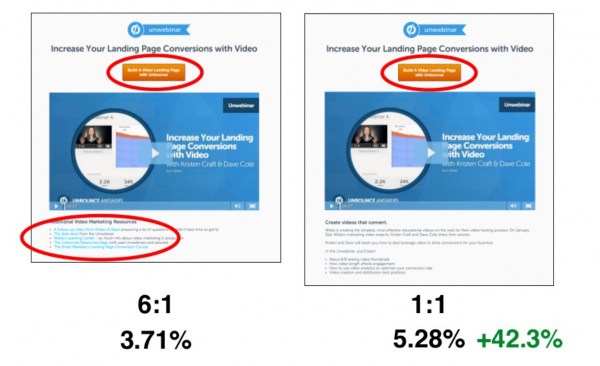
5. A Single Call to Action
If you include more than one call to action on your promoted posts’ or Facebook ads’ landing page, you risk confusing your visitors. To stay clear of this potential danger zone, eliminate all clickable items on your landing page that might distract visitors from accomplishing the primary task you set forth for them.How? Don’t include multiple social icons, unnecessary links and tabs, drop-down menus, etc., because having too many "features" on a landing page will only confuse your visitors. The last thing you want to do is distract your visitors and give them reasons to bounce back to Facebook -- without having done what you want them to do.
Keep in mind: You will have better luck getting a person to do one thing, versus asking them to do two or three things. Stick to one goal, or action item, per landing page you build.
Any information or clickable link or button that does not support the goal of your landing page should be removed. This list is just the tip of the iceberg. There are many other things to consider when creating high-converting Facebook ads’ landing pages. These five tips should, however, get you started off on the right foot. Readers, what do you do to help maximize the conversions of your promoted posts’ and Facebook ads’ landing pages? Do you focus more on perfecting your landing page’s copy or design? Let me know your thoughts in the comment section below. This post originally appeared on Socialmouths.com.
:format(webp))
:format(webp))