6 Web Design Principles You Should Apply to Your Landing Pages
This content provides six design principles for creating effective landing pages that can increase conversion rates and generate leads and sales.
No matter what product or service you sell, a landing page often has a single purpose - to encourage users to subscribe or buy. This, of course, means that a well-optimized landing page can bring you a steady stream of leads and sales.It is not a secret that creating effective landing pages can be challenging. However, by implementing the best web design practices in your landing page designs, you can significantly increase your conversion rates.In this guide, we will discuss six design principles that are predominantly used in website design, and shouldn’t be overlooked when trying to create effective and functional landing pages.
1. The power of white space
Whenever possible, it is a good idea to keep your landing page layout clean and minimalistic so that people do not get distracted by too many visual elements. Using white space allows visitors to focus on your product and call to action.
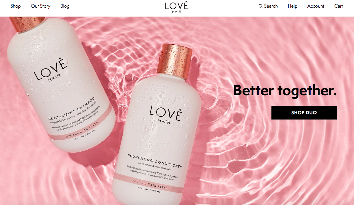
Beautiful use of white space from Love HairMany marketers get stuck in the mindset that they need to include a ton of social proof and other text that convinces people to take the desired action. But when people see a page full of text, they are likely to just click away.Keep in mind that this doesn’t mean you can’t add more text or use a testimonial or two. Just make sure your subheadings, bullet points, and other added content has enough breathing space. Sometimes, adding one of these elements is actually preferable. For example, Copyblogger found out that subheadings encourage people to read your content instead of quickly scanning it.
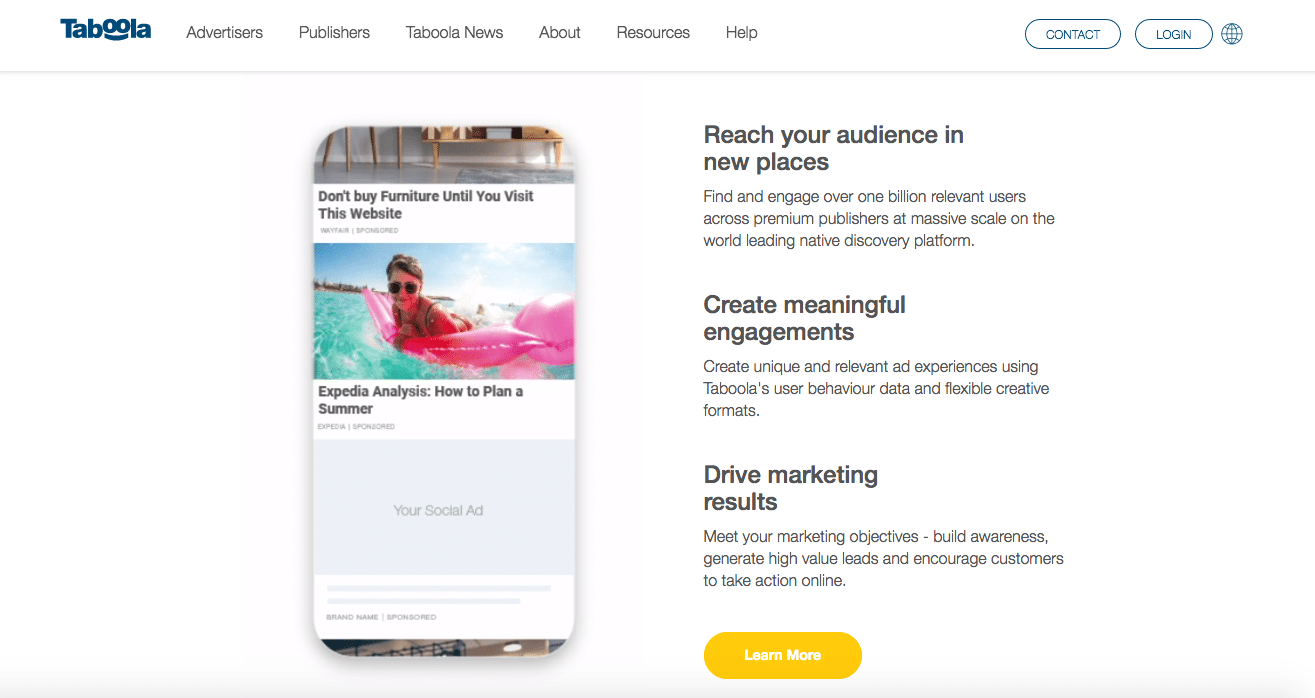
Engaging subheadings on Taboola’s landing page
2. Use the F-pattern
Do you know that different layouts can affect user behavior? Your layout can make or break the user experience. One effective design strategy to have in mind when designing your landing pages is the F-layout.Copious eye-tracking research showed that users scan web pages and mobile screens in various shapes, and one of them has the shape of the letter F. It means that people look at the top of the page first, then the upper left corner, and the left side of the screen (and only occasionally glance at the right side of the screen).When you know what areas on the screen are the most viewed, you can place important elements such as a logo, CTA button, or offer, in the top left quadrant of the design.Take a look at this heatmap for Guardian Unlimited:
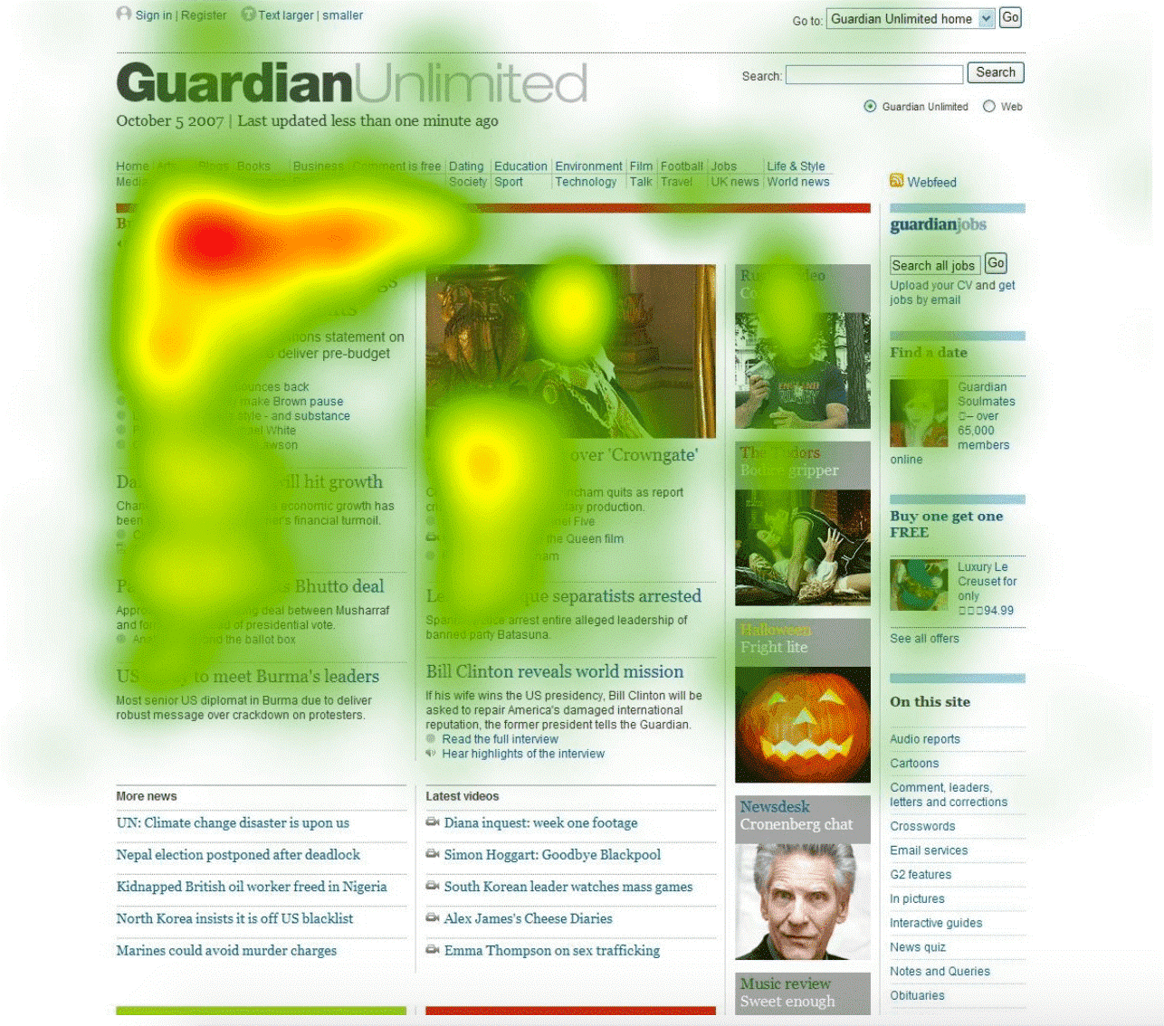
Searchenginejournal The red and orange hotspots show where people's attention lingers the longest.Notice that browsing a web page is done in the same way as people read books - from left to right, from top to bottom. A sidebar is usually briefly noticed. The brand-mark, images, and subheadings draw the most attention.So if you want to ensure that the most important part of your landing page message is seen, try placing it at the top of the page, because not all users will read everything on the page line by line.
3. Apply contrast and color
When users land on your web page, they are just one or two clicks away from a conversion. You definitely don’t want to stumble here just because you didn’t give any thought to contrast and colors. Your website design should include a color scheme that makes sense for your brand, is in no way distracting, and never hinders the readability of the text that is on your landing page. As Neil Patel says, “It is crucial to consider that consumers place visual appearance and color above other factors when shopping.”He also offers that you should choose colors depending on the nature of your landing page: target impulse conversions using red, orange, black, and royal blue
- reach shoppers on a budget with navy blue
- attract women for clothing brands with soft colors like pink and light blue
- use green to help users relax
- use black for luxury product websites
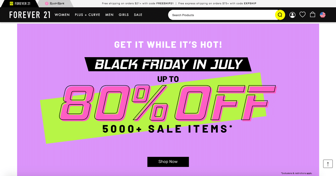
Forever 21 uses soft colors in their color schemeIt seems that the American clothing brand Forever 21 knows this rule very well - they used soft purple and pink colors for sales popups.Color and contrast can also be used to highlight the most important parts of your landing page, like your CTA buttons. Numerous studies have shown that a red button converts better than a blue one. But it’s not only about the red color.You can, for instance, use a separate color for a CTA button that has not been used anywhere on the page before like Airbnb does. You’ll make it stand out and draw attention.
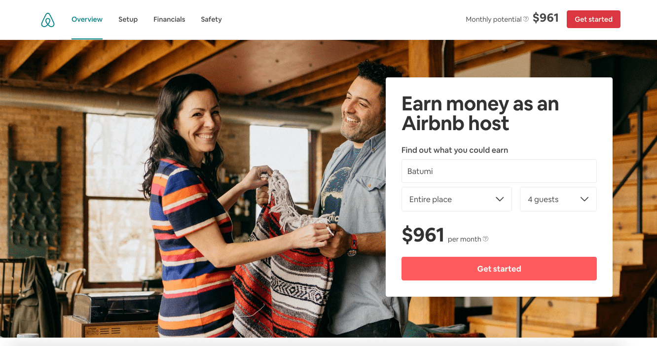
Airbnb red CTA button is hard to missThe contrast between your text and background should also be very high. A background that features images, graphics, or illustrations can make text hard to read. Make sure that is not the case with your landing pages. After all, those few lines of text are usually the crucial part of getting that conversion. The Airbnb example shows how a complex background doesn’t affect the readability of your lead magnet offer.
4. Don’t forget mobile-first design
People use mobile devices more and more every day. Sixty-two percent of internet traffic is done using mobile phones. Unless you use paid promotions to specifically target desktop users, a big chunk of your visitors will be people looking at your landing page with their smartphones.The reason we mention that is because many landing page builders, especially the cheaper ones, are not as reliable as people think. They all offer you templates and encourage you to use given building blocks to modify those templates, ensuring you that the software will optimize the view for all screen sizes. However, in many cases, a major change to the selected template will move some elements out of alignment for other screen sizes.So, whatever tools you use, be sure to thoroughly test your landing page when it goes live using multiple devices, so you ensure you have a responsive landing page.
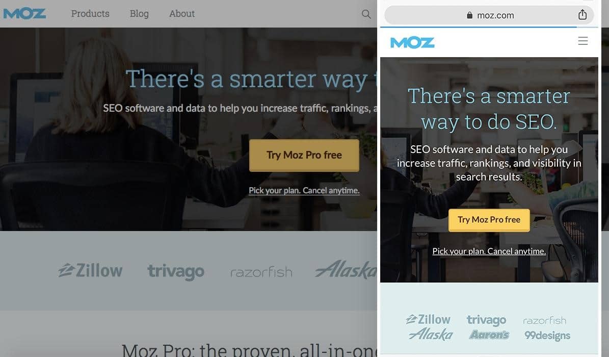
Moz.com’s desktop and mobile version are responsiveIf you have a more complex landing page, you should also consider making different versions for different devices. There is no rule that all the same elements have to be visible on each device!
5. Use personal photos to build trust
When a person considers buying online, the main issue is trust. How do they know that this website is trustworthy? Recent studies show that consumers associate photos of people with the product.This is one of the main reasons why many influencers across all industries use a nice headshot for their homepage.
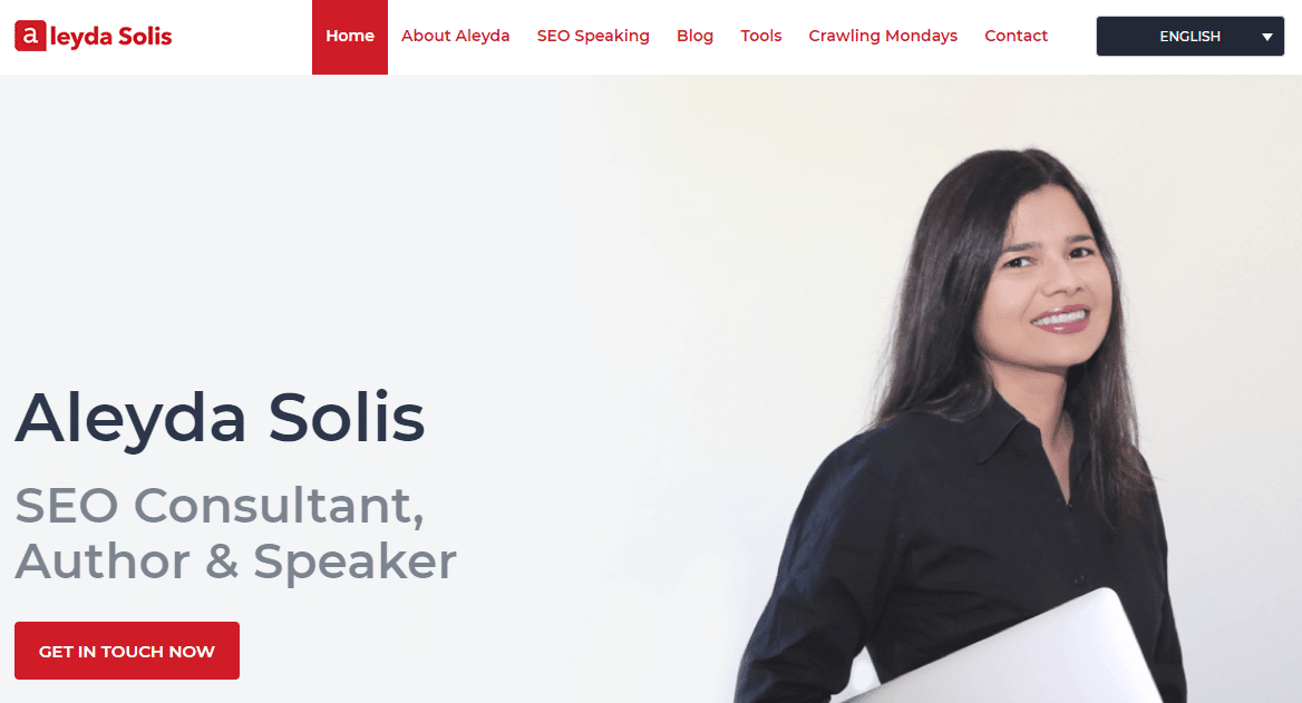
Aleyda Solis (marketing influencer)Medalia Art is an online art shop that showcases paintings from famous artists on their homepage. They decided to run an A/B test to see what would happen if the paintings were replaced by the artists’ photos.

Screenshot with illustrations

Screenshot with the pictures of artistsThey learned that the conversion rate for the paintings was 8.8% while the conversion rate with personal photos doubled to 17.2%.Similar research made by MarketingExperiments showed that conversion rates started to grow when they replaced a regular stock photo with a picture of their founder. They saw an increase in signups by 35%.
Design with a stock photo
Design with a real personSo, photos of people can definitely have a positive impact on your conversions and website’s trustworthiness. Try using real images instead of stock photos. Moreover, pictures of people with a focus on their face will have a much stronger emotional connection.
6. Keep it simple
By now, you should be aware that a perfect landing page design includes a clean layout and plenty of white space.Applying the KISS principle (keep it simple, stupid) will encourage you to keep your page minimalistic. What does that mean in practice?It means:
- choose one font you will use on the landing page and focus on variations of that font if you need some diversity
- choose two or three colors you will use on your design elements (e.g. forms, text, CTA); your brand colors are often a good choice
- use the minimum amount of text necessary
- stick to one or two design formats (e.g. rectangles, squares, circles, ellipses)
- use a single CTA
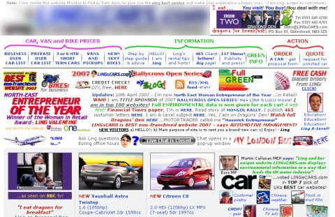
Just take a look at this website design that breaks all of these rules:
Bad website design exampleThough this is an extreme example, you can understand how visitors want to abandon the site immediately. Check out this guide for other annoying website design trends that you should stay clear from when designing your landing page (or any other page on your website, for that matter).In the same fashion, here is an example of a page that uses multiple CTAs that only confuse the visitor and surely destroy the overall conversion rate.
It is important to clean your landing pagesThe focus of your landing page should be to sell you one thing - your product or service - which is also the reason why it should and CAN be kept simple.To finish this off, here is an excellent example of a landing page with minimalistic aesthetics, a contrasting CTA button, and lots of white space:
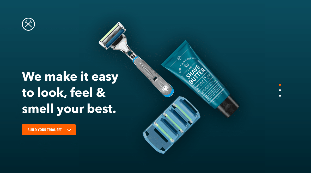
A simple yet beautiful landing page example from Dollar Shave Club
Conclusion
Without a doubt, the above principles are important to keep in mind while you’re designing your next landing page.
Keep the layout clean and simple, be smart about placement, do some research when choosing your colors, use real images instead of stock photos where possible, and test your site across multiple devices.
Create your first landing page now
Get Started Today. It’s free and we don’t need your credit card.