7 Tips for Designing Mobile-Friendly Landing Pages
Learn seven tips for creating mobile-friendly landing pages, including concise copy, fast loading times, and smart navigation techniques.
Over the last decade, mobile usage has gone from nearly non-existent to 50% of all web traffic. That’s quite the jump! This is why it’s so important to keep mobile in mind when designing your landing pages. In this post, I’ll cover seven tips for creating mobile-friendly landing pages.
Keep copy and forms concise
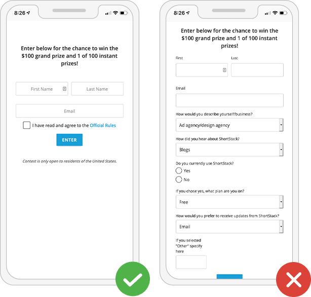
You have less than 15 seconds to grab someone’s attention on your website before they bounce. This is doubly true on mobile; nobody wants to scroll through long blocks of copy just to learn what you do. Instead, keep your message short and to the point.
TIP: Write out what you want to say, then edit it with the goal of removing redundancies, unnecessary adverbs and adjectives, and anything else that doesn’t need to be there.
The same concept goes for the forms you create. Don’t use fields that you don’t absolutely need customers to fill out. If you can, stick to just email addresses and maybe a name. This will increase the likelihood that folks will actually fill out your forms.
Avoid long loading times

This rule is true for images you add to the web in general; however, it’s even more important when considering loading times on mobile devices. Mobile users who are on-the-go might be loading your landing page on a data connection. Keep your file sizes smaller, which will allow them to load faster. Use images that are web-quality instead of print quality -- nothing more than 72 dpi is necessary for the web.
Draw attention to one CTA
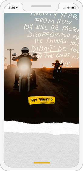
Much like keeping your text concise, keeping CTAs (calls to action) to a minimum helps focus your mobile landing page visitors. To determine which CTA to highlight, think of your goals. Do you want people to sign up for your mailing list, sign up for a free account or do a bit of shopping? Make your goal, or the first step toward achieving your goal, the CTA you highlight on your mobile landing page.
Consider separate content on mobile
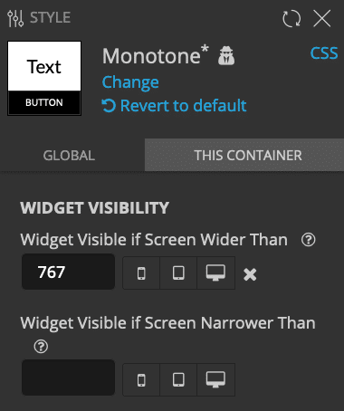
Sometimes the best thing to do is create one message for visitors on mobile and a different message for desktop visitors. On desktop, you might be able to go into a bit more detail or use a different image to help get your point across. In ShortStack, we provide a handy tool that lets you specify the size of screen you want content to display on. You can choose to only show content on screens narrower than a specific size or wider than a specific size. This allows you to craft your message to target the device someone visits your landing page on.
Use smart navigation
You might be noticing a pattern with our mobile suggestions -- keeping mobile visitors focused is important. This applies to your landing page navigation as well. Instead of laying out all of your navigation options across the top of the screen, try the hamburger menu option. Hamburger navigation refers to those three little lines you see in the upper right or left corner of many mobile websites. When clicked, these lines reveal the navigation options. Using hamburger menus keep your most important information front and center, while still allowing people to access the rest of your website if they choose to.
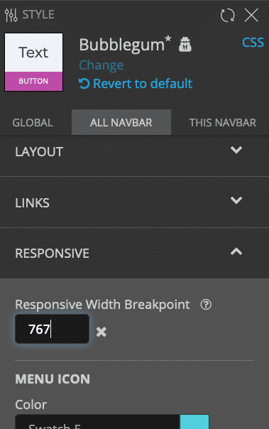
TIP: Use ShortStack’s Style Panel to enable hamburger menus for mobile viewers.
Design single-column layouts
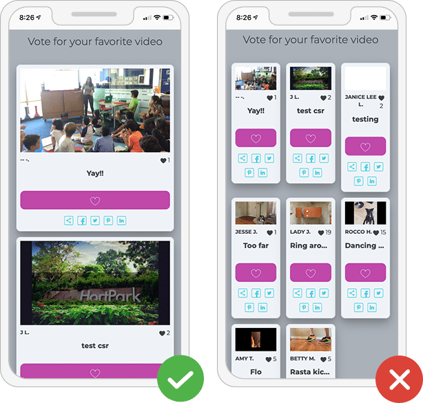
This might surprise you, but despite getting bigger over the last few years, mobile screens are still much smaller than desktop and laptop computer screens. Showing content across multiple columns can make it difficult to read on a mobile device. The solution? Try using responsive design that changes multi-column layouts to a single column when viewed on mobile devices.
TIP: Use ShortStack’s Style Panel to enable a responsive trigger width for multi-column layouts. This will update your design to display in a single column for all screens narrower than the pixel width you indicate.
Use mobile-friendly positioning
Steer clear of static pixel sizes while styling your landing page. Pixels are not scalable, so when you indicate something should be in a particular position using pixels, say 200px from the left, then it will be at that exact place regardless of the size of your screen. Thus, something you want 200px from the left on desktop might not even show on mobile due to the screen size. Instead, use relative measurements such as percentages or EM sizing. These measurements take into account the size of the screen the visitor is viewing the content on, and then displays the content accordingly. This means, when you indicate you want content to display 10% from the left, then the content will be adjusted so 10% of the screen is to the left of the content. Now that you have a few key suggestions for creating landing pages with mobile visitors in mind, it’s time to put them to good use on your ShortStack landing pages.
Create your first responsive contest now
Get Started Today Sign up for our free trial today. No commitments, cancel anytime.