A Guide to Sizing and Using Images in ShortStack’s Campaign Builder
Learn how to optimize images for your landing pages with ShortStack's best practices for sizing and using graphics effectively.
ShortStack’s templates are a great guide for helping you build professional-looking landing pages, contests, and giveaways, but when you’re looking for a truly custom look, nothing can compete with using custom images to complement the look of your brand.When it comes to using graphics and images in your landing pages, knowing a few tricks of the trade will take your campaign to the next level. Image size and placement are ultimately up to you, but we’d like to share some best practices on optimizing images for your landing pages. In this article, we’ll outline everything you need to know when sizing and using images in your ShortStack campaigns.
Header images
Header images bear the weighty responsibility of delivering your campaign’s first impression. Even when coupled with a compelling headline, the header image can inspire visitors to stay and read on, or bounce. So, it's no exaggeration that header images can make or break your campaign. Also, header images come with the most complicated set of “rules.” For these reasons, we’ll tackle what it takes to successfully display the mighty header image first.
Screen Size Matters
When you look at the same screen every day, it’s easy to forget that there’s a world of different screen sizes out there. You may design something to look fabulous on the 15” MacBook display you're used to viewing, but to those using shiny Thunderbolts, your 15” design will look much different.
Mobile devices make up about 40% of all online traffic in the US
When choosing a header image, make sure it is large enough to span across most screens. We can’t account for those designers using television-sized monitors, but for the majority of us using 20”-ish or smaller screens, we can enjoy viewing landing pages as they were intended. To do this, keep the width to about 2000px. The height is up to you. To do your full due diligence, you must also account for the tiniest screens viewing your campaign. This step is incredibly important because mobile devices make up about 40% of all online traffic in the US. If your header graphic is crucial to the design of the campaign, make sure it still renders as expected when you shrink your screen. Whether or not the graphic maintains its aspect ratio will depend on how it's displayed, which is the perfect segue into the next topic...
Background vs. Foreground
Understanding the pixel width of your graphic seems pretty straightforward in creating a well-functioning design. However, knowing when to display the graphic as a background or as a fixed image in the foreground can seem a little more bewildering. I’ll break down the differences between the two so you’ll know when including your image as a background is better or when to display it using ShortStack’s Image Widget. To understand how a background image functions, think of the set used in a play. It stays put on the stage while the actors move around in front of it. In ShortStack, this is how background images work as well. When an image is added as a background, the content in your widgets will be placed in front of it and will be positioned based on the other widgets around it.
See how adding more text affects the overall size and cropping of the background imageMore importantly, when the background is displayed on a smaller or larger screen, the aspect ratio will not remain fixed. This means that text, entry forms, and anything else placed on top of the background will shift to fit the device’s screen but the background will not shrink or expand to fit.
Most of the image has been cropped out at mobile widthTherefore, header images are best when they contain a repeating or immaterial image. Like a forest, ocean, or a random collection of objects. In other words, ask yourself this - if only a small portion of the header image were visible, would it still look good and make sense in your campaign? If the answer is yes, then it's safe to use as a background.
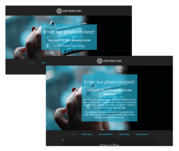
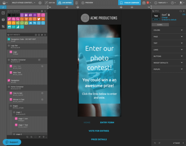
When you need to display 100% of the header image, use an Image Widget to maintain its aspect ratio. This means, when it's sized way down to the screen on a mobile device, you’ll still see all of it.Although the image will be shrunk and not cropped, you’ll still need to test your fixed image on various screen sizes. If it’s too small, it may require a bit of rethinking. In this example, the designer created a special mobile version of the header image and used desktop and mobile visibility settings to display the respective image on its intended screen.
You may want a more vertical layout for mobile devices.
Body images
Maintain Uniformity
The images within the body of your landing page aren’t necessarily imparting any make or break first impressions, but you’ll want to maintain the continuity of your campaign’s professional appearance by abiding by a few loose laws.For example, you may want to display images in a column or row. By keeping the aspect ratio the same in all of your images, the appearance will be satisfyingly uniform.
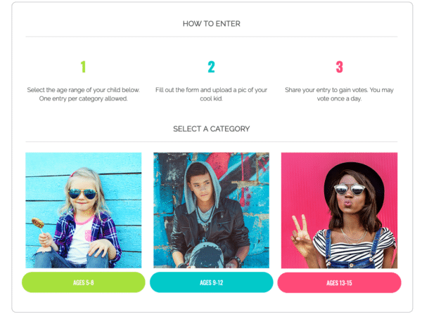
These images all have a 1:1 aspect ratioI’ll mention this again because it can’t be said enough: make sure to test how images look on different screen sizes. In ShortStack, thanks to the preview ruler in the Campaign Builder, this will just take you a few seconds.
Uploaded/Voteable Images
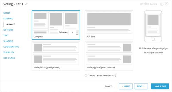
When hosting a photo contest, you may feel you don’t have much control over the content that is submitted and how it’s displayed within your campaign, however, you have options that can help keep your contest looking tip-top.In ShortStack, use the display options in the Voting Widget to change the look of how entries are displayed on a page. Perhaps each entry deserves an entire row, or the volume of entries is best displayed as a tiled gallery.
Example of text here.If you’d like to get extra particular, you can always require a specific aspect ratio be used for uploaded entries, and use ShortStack’s moderation capabilities to disapprove those that don’t adhere to your requirements. However, this could severely impact the participation rate of your campaign. Another method would be to only allow entries from Instagram, but again, although your entries will be satisfyingly similar in size, this is not considered a best practice due to some limitations with the Instagram photo uploads and certain browsers.
Summary & Resources
Here are a few rules to follow when using images within your campaign:
- Use a width of 2,000px for a header image or for any image you’d like to span across most screens.
- Use repeating or arbitrary images as backgrounds. Backgrounds do not maintain their aspect ratio.
- Whether using a background or fixed image, always, always always check mobile and other screen sizes.
- Use consistent aspect ratios for images in rows or columns.
- When collecting user-generated images, choose a layout that works best within your campaign.
Resources
If your understanding of image sizes and using them within the Campaign Builder is still a bit muddy, here are a few resources to help clarify these concepts.
- Sizing Guide
- Working with backgrounds
And if you still have questions, don’t be shy! Our support team is standing by. Send an email to theteam@shortstacklab.com.
![Your Guide to Facebook and Instagram Contest Rules 2022 [TEMPLATE]](https://cdn.shortstack.com/website/blog/social-media-contest-rules-template/68b0e4bd0eaeb3b4049ada0c_653795a0ebd89670540de484_fb-ig-rules-featured.png)