Header images are often the first thing visitors notice when they arrive on your website, landing page or marketing campaign. This makes them one of the most important tools for conveying what you want your visitors to know about your site and your business. Now, don’t let me fool you, I’m no design expert. However, I spoke with our resident graphic design guru, to learn more about the process she uses for creating effective header images. She shared best practices on how to incorporate text for different use cases, what types of images work best and where to find images for your campaigns.
Live Text vs Graphic Text
To start, it’s important to think about the text you want to use with your header image, if any. Most header images include text in one of two ways, either as live text or as graphic text incorporated into the image.
What is live text?
Live text is text added over a background image. In ShortStack, you could add this text using a Rich Text or Text Widget. Advantages to using live text include:
Searchability: Live text added to your campaign is searchable by browsers, giving your site extra SEO power;
Text responsiveness: Live text will automatically resize with the width of the device from which the viewer is accessing your campaign; and
Editability: Live text can be easily edited within your ShortStack Campaign Builder.
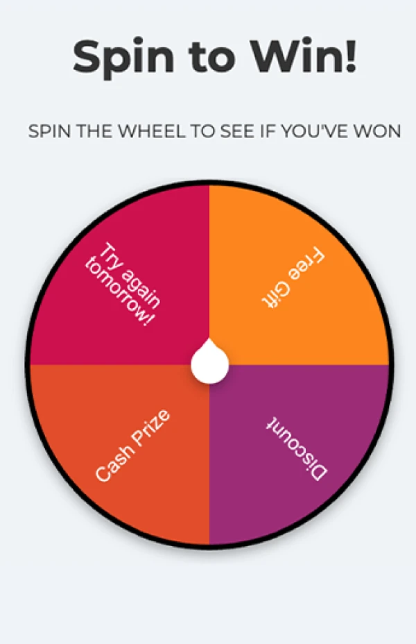
INSIGHT: We use live text in our templates due to the advantages this option provides.
What is graphic text?
Graphic text is text that is part of an image. You can create an image that includes graphic text using a design program such as Photoshop or an online tool like Canva. Advantages to using graphic text include:
Greater creative freedom: Graphic text allows you to use whatever fonts you want and to layout text however you choose; and
Image responsiveness: Depending on your design, using graphic text may allow you more flexibility in terms of image responsiveness on different sizes of screens. However, if you have small type in your image, this might decrease the readability of the text when it scales down on mobile devices.
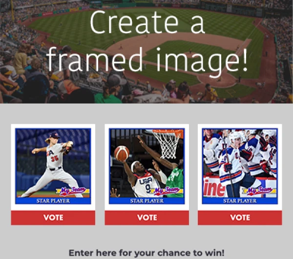
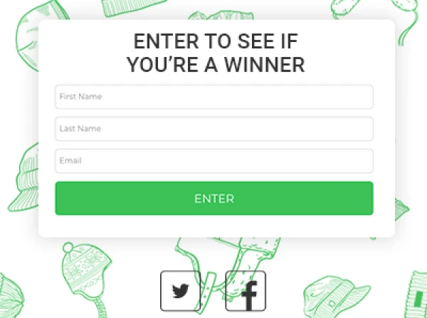
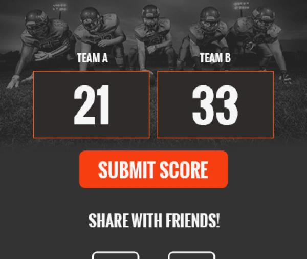
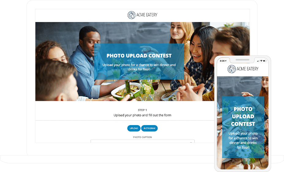
This campaign header uses live text, making readability better on mobile.
Selecting an Image
After you determine what type of text you will be using, it is time to decide what type of image you will use to complement your text. You might consider using:
A repeating pattern: This type of image is great for responsiveness, as it doesn’t matter how wide the image is for the same content to display;
A simple image: An image that isn’t “busy” is better for overlaying text than one with too much going on;
A macro image with a bokeh effect: A macro image is a close-up shot of the subject, and adding a bokeh effect will blur out the background of the image, which brings the focus to the subject of your header;
An image with the subject set to one side: Setting the subject of an image to one side leaves room for text on wide screens which increases text readability; or
An image that blends to your campaign’s background color: This type of image works well for responsiveness and viewing campaigns on mobile devices, as you don’t need to worry about how tall your campaign is when creating your image.

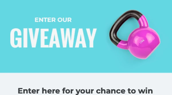
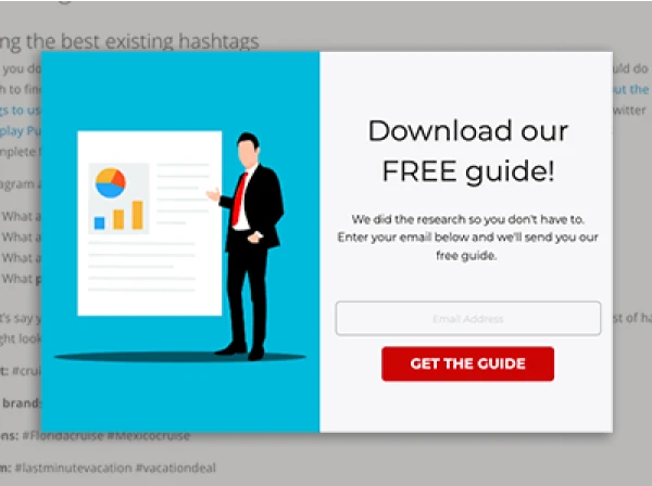
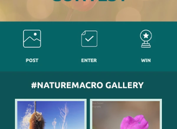
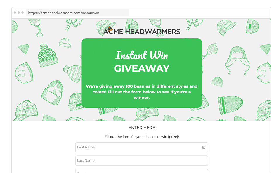
This header has the image subject contained to one side leaving room for a text block on the other. Not sure where to find images? We suggest Shutterstock, Pixabay or Adobe Stock. Otherwise, you can take your own photos or create your own images and use those instead.
Image Aspect Ratio
When selecting an image, it’s important to consider the image’s aspect ratio. A tall narrow image may work well on mobile, but it might not look great on desktop. Alternatively, a wide image with small details will lose its impact (and, potentially, some of the content) when scaled down on mobile. Sometimes it’s best to have two images, one for mobile and one for desktop. You can use our device-specific visibility settings to show different content on mobile versus desktop.
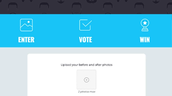
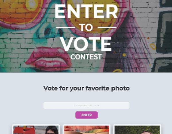
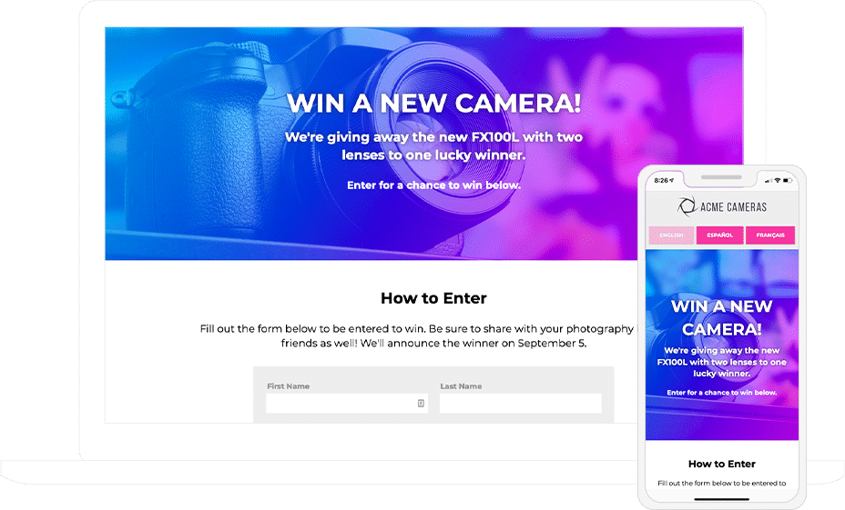
This wide image works great on desktop, however, on mobile you lose the main subject of the photo.
Text Styling
Once you finalize the image for your header, it’s time to add in your text. The most important thing to keep in mind when adding text is readability. The following techniques can help improve the readability of the text in your header:
Add a color block behind the text: A solid color behind your text will provide a barrier between the background image and your header text;
Increase image transparency: Applying transparency to the background image will allow text without transparency to stand out against the background;
Apply a text shadow: Using a shadow around text characters to give them more depth;
Use bolder fonts: Bolder fonts give text characters greater weight;
Contrast text color with image colors: Using contrasting colors will draw viewers’ attention to the header text; and
Use different font sizes for important text: Breaking up text with different font sizes allows the most important information to stand out.
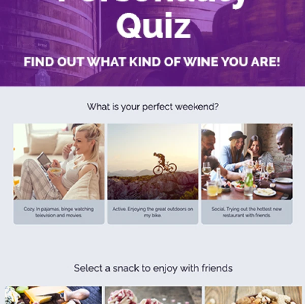
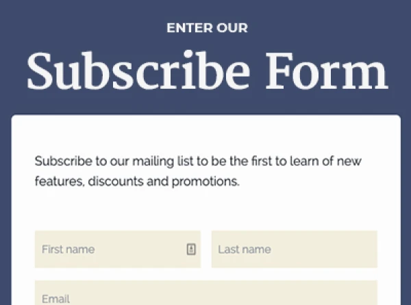
This header uses a repeating background pattern and a color block behind the text, making it stand out.
Responsiveness
Think you’re finished? Not so fast. You need to make sure your header image looks good on both desktop and mobile devices. Keep the following considerations in mind when designing your header to avoid any issues:
Aspect ratio: How wide and tall your image is impacts how it looks on mobile devices (see note above);
Image resizing: Be sure the text and important image elements are still legible when an image resizes on mobile; and
Image scrolling: Images might increase the amount of scrolling visitors must do on mobile devices, so be sure that important information doesn’t require a lot of scrolling.
There you have it! The top tips for designing an effective header image. Have any questions on styling your campaign? Shoot our support team a message: theteam@shortstacklab.com.
Want more design tips and ideas? Check out the articles in our Design series.
About the author
Jane has over a decade of martech experience, with an emphasis in content marketing, UX, and customer success. Her combined skillset and years of hands-on experience make her a valuable player in the industry. In her free time, Jane loves quiet family dinners at home and a good book.
Recent posts
Go back to blog

Get marketing tips straight to your inbox
Launch an irresistible giveaway. Get started for free.
Join 630.000+ marketers that are boosting engagement and sales.