Design Tip: 3 Tips for Using Color on Your Landing Pages
This content provides tips for developing a color palette, using color swatches, and making calls to action stand out.
We all know how important color is to brands. Different colors can convey different meanings and can affect our buying behavior. For example, if you run a yoga studio, then cold colors like blues and greens would evoke a sense of calm. Likewise, maybe you’re selling a new sports drink and you want to bring forth feelings of high energy, then warm colors like reds and oranges might do the trick.Brand guidelines are often thoroughly discussed and reviewed before they are implemented, but how do you decide which colors to use if you don’t have brand guidelines to follow? We have tips for developing a color palette, using color swatches on your ShortStack landing pages and making your calls to action stand out.
Develop a palette
A color palette is the composition of colors you have chosen for your project. Having a set color palette makes your life a lot easier when deciding how to style your landing page, as you won’t need to figure out which colors work well together on the fly. If you don’t have brand guidelines you need to follow, then create a palette before you get started on your landing page.Color scheming will help you develop your own color palette. Some basic color schemes are:
- Monochromatic schemes: All elements use the same color, but with different shades, tones and tints,
- Complementary color schemes: Colors are across from each other on the color wheel;
- Analogous color scheme: Three colors that are beside each other on the color wheel; and
- Triad color schemes: Three colors that are evenly spaced around the color wheel.
Once you have chosen a scheme, a color wheel will help you to determine which colors to use in your color palette. Basic elements of the color wheel include primary, secondary and tertiary colors.
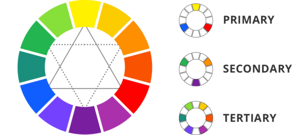
- Primary colors: The three primary colors are yellow, red and blue.
- Secondary colors: The three secondary colors -- green, purple and orange -- are made by mixing the primary colors.
- Tertiary colors: Tertiary colors are made by mixing primary and secondary colors -- e.g. blue-green or orange-yellow.
Further variations in color include:
- Shade: Adding black to a color;
- Tone: Adding grey to a color; and
- Tint: Adding white to a color.
Okay, now you’re in a good spot to get started with your color palette. If you need a bit more inspiration, check out these resources:
ColourLovers: http://www.colourlovers.com/Coolers: http://coolors.co/044389-55d6be-fcff4b-ffad05-5995edColormind: http://colormind.io/
Suggestion: Still not sure how to create your own color palette? Try using a ShortStacktheme
. We offer more than 30 to choose from in our Style Panel.
Implement color swatches
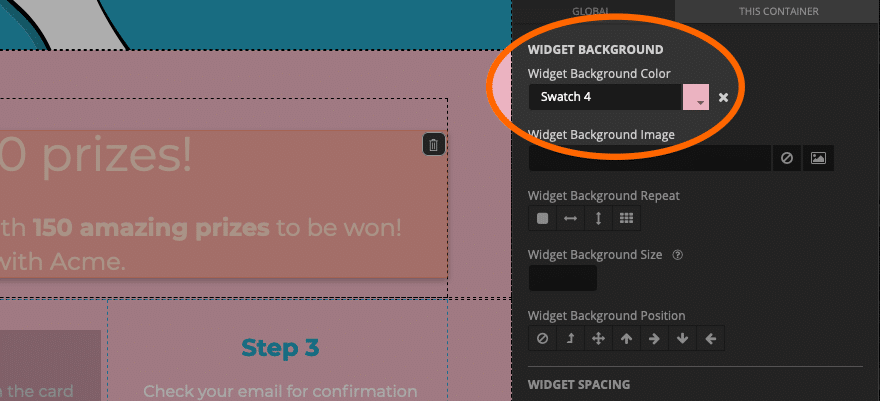
When you create your landing pages in ShortStack, you can use our Style Panel. Within the Style Panel, we offer a handy little tool called swatches. Using swatches will allow you to easily apply the colors you’ve chosen for your palette to different elements of your landing page.
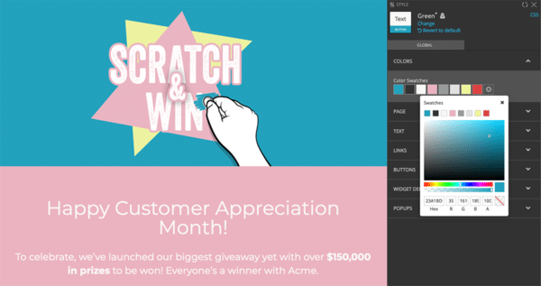
Using ShortStack's swatches allows you to quickly apply color changes to your landing pageWhen you start applying your color scheme to your landing page, set up the colors from your color palette as swatches. Then, just choose one of those swatches instead of typing in the Hex code for a color when styling different elements of the landing page. If you need to adjust a color within your palette, you can change the color of that swatch, and all elements you assigned to use that swatch will automatically be updated to the new color.
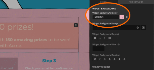
Apply swatches to elements on your Landing Page instead of hexcodes.
Suggestion: Want to reuse your color swatches on another ShortStack landing page? Try saving acustom theme
to use again later.
Vary button colors according to importance
Calls to action (CTAs) are essential elements in most landing pages. Many times, these CTAs are in the form of buttons. It’s normal to have a number of buttons on your landing page, some are CTAs and some serve other purposes. When applying your color palette to your landing page, choose a color for the CTAs and buttons you want to call the most attention to. Then, use a different, milder color for secondary buttons. This helps the important buttons stand out.
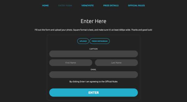
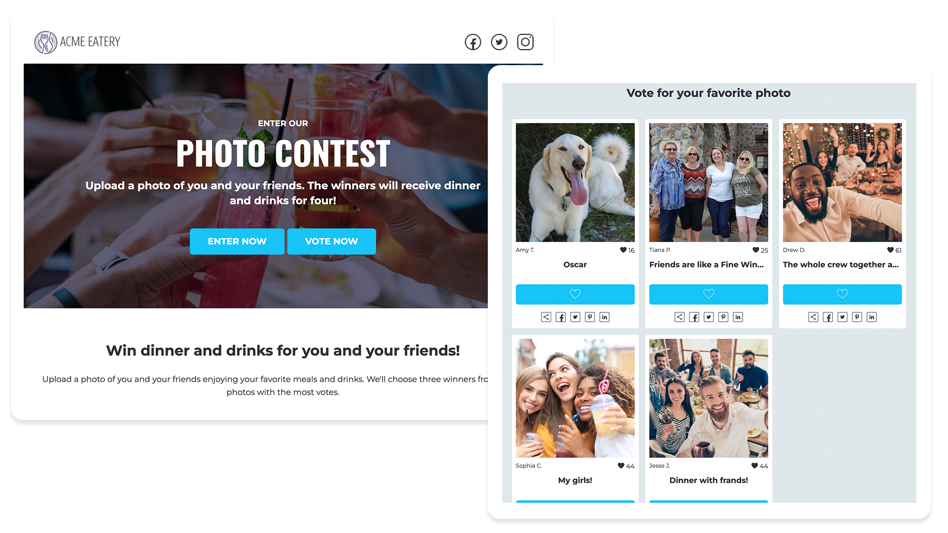
Use bolder colors for your CTA buttons. This contest has only the "Enter" button as a solid color.
Suggestion: Don’t include too many CTAs in one landing page. Focus your visitors on the CTAs most important to your goals.
There’s still a lot to learn about using colors, but now you have the basics to help you get started. Want more design tips and ideas? Check out the articles in our Design series.
Create your first contest now
Get Started Today Sign up for our free trial today. No commitments, cancel anytime.