Design Tip: 4 Pointers for Choosing and Applying Fonts on Your Landing Pages
Learn how to choose the right fonts for your marketing campaigns and add them to your ShortStack landing page.
The fonts you choose for your marketing campaigns say a lot about your brand. For example, a security company may lose credibility using the Comic Sans font, while a yoga studio’s atmosphere might feel less calming if they use Rockwell.Most of the time, your brand guidelines will dictate which types of fonts you choose. However, how exactly do you add your fonts to a ShortStack landing page? Furthermore, how do you select a font if you don’t have any brand guidelines in place? We have some tips for choosing fonts that fit your brand, establishing a font hierarchy, and using built-in fonts or adding custom fonts in ShortStack.
Choose your fonts
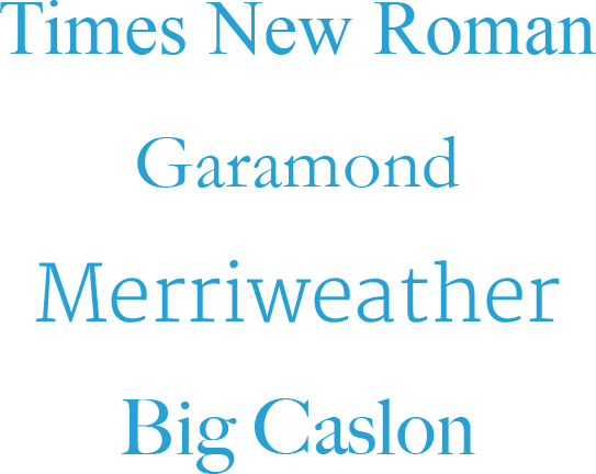
Many brands define which fonts to use within their brand guidelines. But what do you do if you don’t have any brand guidelines to pull from? You’ll need to figure out which fonts fit your brand. To do this, think of the “personality” of your business and your audience, then pick some fonts to match. This can be a pretty complex process, but we have a couple of suggestions on how to get started.At a basic level, you can choose between serif and sans serif fonts. Serif fonts have a decorative flourish added to the horizontal and vertical strokes of the letters. These flourishes are often referred to as the “feet” of the letters.Serif fonts tend to be considered “classic” and are considered a more formal style. Brands that want to give their customers a sense of reliability and trustworthiness might consider using serif typefaces. Common serif fonts are Times New Roman, Garamond, Merriweather and Big Caslon. For example, you would probably recognize the text you read in a newspaper or book as using a serif font.
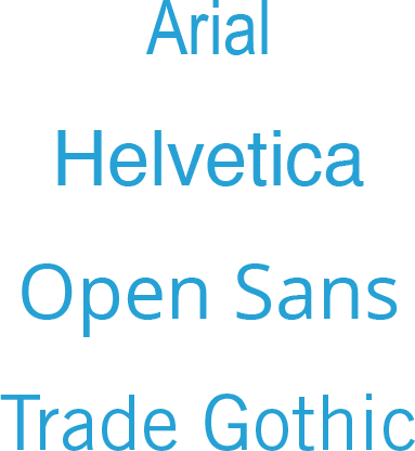
Common serif fonts. Conversely, sans serif fonts do not have a decorative flourish. Sans serif fonts often evoke a sense of modernity and simplicity. These fonts might appear “cleaner” due to the simplicity of the letter strokes. Common sans serif fonts are Arial, Helvetica, Open Sans and Trade Gothic. Brands that want to appear friendly, approachable and casual should consider sans serif fonts. For example, many technology companies choose sans serif fonts for their logos and their platform text.
Common sans-serif fonts. Additionally, script fonts are also used and look like cursive handwriting or calligraphy. There are a lot more flourishes within the characters of script fonts than in serif and sans serif fonts. Common script fonts are Brush Script, Dancing Script and Liza. Script fonts evoke a sense of elegance and calm. For example, day spas and yoga studios tend to use script fonts in their logos and header text.

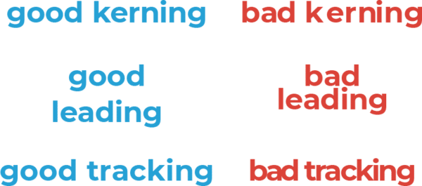
Popular script fonts. When choosing a font, readability is key. After all, what’s the point of adding text to your landing page if nobody can read it? Three concepts to keep in mind that are important for readability are kerning, leading and tracking.Kerning: the space between characters in a wordLeading: the space between lines of textTracking: the space between words in a sentence
Try typing out some text using the font you chose. Does it clearly communicate your message? Do the letters and words seem too close together or too far apart? If that’s the case, you might consider trying another font, unless you are able to manually update these attributes.IMPORTANT: It’s best to choose a font from a commonly used source, like Google Fonts or Adobe Font. Although your brand is unique, selecting a unique font that isn’t widely available can become a problem when building websites, landing pages, etc. Furthermore, more exclusive fonts might require web-use licensing, and that can be expensive as you could be charged based on usage (e.g. views) or another metric.
TIP: Check out this resource for choosing a font:How to Choose the Right Fonts to Build Your Brand
Determine a font hierarchy
After you choose some fonts to use for your landing page, you’ll want to establish a hierarchy. It’s best not to use more than three fonts on your landing page. You can mix different fonts, but you want to make sure the fonts fit the purpose.What do I mean by purpose? For example, your landing page’s header should use a font that is larger and grabs more attention than the font you use to write paragraphs on your landing page. A common font hierarchy consists of a headline, a subheader and paragraph fonts. You might have additional levels of headings or titles, but these might be variations in size on the fonts you choose for other aspects of the hierarchy.
Header
Your header is used to catch people’s attention. It should stand out from the rest of the text on your landing page. Headers have larger font sizes and they tend to use bolder fonts.
Subhead
Subheads will have smaller font sizes than the header, but they might still be bold. They are used to convey information that is important, but less important than the information in the header.
Paragraph/Body
This is the text that’s used the most throughout your landing page. It won’t be as large as the header or subhead text. The most important aspect of this text is that it’s readable.
Choose from built-in fonts
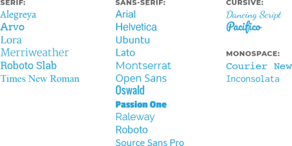
The ShortStack Style Panel includes 21 built-in fonts that you can apply to your landing page. They are:
This handy video shows you how to use the Style Panel to style the text on your landing page.
Add custom fonts using Google Web fonts and @font-face Rules
Want to use a font that isn’t available in the ShortStack Style Panel on your landing page? You can. You’ll just need to use a bit of CSS. The CSS Editor is accessed by clicking the CSS link in the upper right corner of the Style Panel. There, you can add a Google Web Font or use @font-face rules to pull in a font hosted on your server.Now that you have the basics for choosing and adding a font to your landing page, it’s time to learn some more design tips. Our Design series is full of useful information for creating effective landing pages for your next online marketing campaign.