How to Build Smarter Entry Forms to Optimize Conversions and Reduce Abandonment
Learn how to reduce form abandonment rates and increase sales by improving the design and optimization of your entry forms.

An entry form, whether it be tied to an online shopping cart, a giveaway, or a request for more info, can be a powerful way to learn about your audience. But form abandonment rates are higher than ever. In fact, 81% of users have abandoned an online form after starting to fill it out.
With advancements in entry form creation, you can collect qualified leads while greatly reducing form abandonment rates. Improving the design of checkout forms can reduce form abandonment by as much as 35%. This is equivalent to $260 billion in recovered orders.
In this article, I’ll go over ways you can improve your entry forms to collect more qualified entries, and ultimately increase sales. But first, in order to understand how to build an optimized entry form, let’s look at why people abandon entry forms in the first place.
Why are forms abandoned?
It would be impossible to lean over the shoulder of every internet user to know exactly why they abandoned a form. Maybe their cat swatted the mouse and just so happened to close their browser. Through data and analysis, researchers have learned how to virtually lean over the shoulders of enough users to surmise a few of the major reasons users abandon forms - with a few cat-swatting outliers aside.
Security Concerns
Let’s start with a big ‘un. One of the most prevalent reasons for form abandonment is concerns over data security. As data breaches continue to make headlines, along with horror stories of stolen identities, form users are on high alert when it comes to doling out their data. As a result, the smallest indication that a form may be lacking in robust security features is almost certain to increase the likelihood of users abandoning it. Proof of this is in the research. According to one study, 29% of abandonment can be attributed to concerns about security.
Industry Type
An interesting piece of research looked at the highest rates of form abandonment by industry. Surprisingly, commercial airlines were at the top of the list. Are airline companies particularly bad at building entry forms? Or is their high-abandonment rate simply due to the nature of their business itself? My guess is, when booking a trip, people tend to check flights and prices several times before actually booking the flight, i.e. abandoning an entry form multiple times before actually completing it.
Although the airline industry can’t change the nature of their business to reduce their form abandonment rates, it’s something to keep in mind when evaluating your entry form conversions and the nature of your industry. In other words, is your sales funnel naturally prone to form abandonment and is there anything that can be (or needs to be) done about it?
Form Length
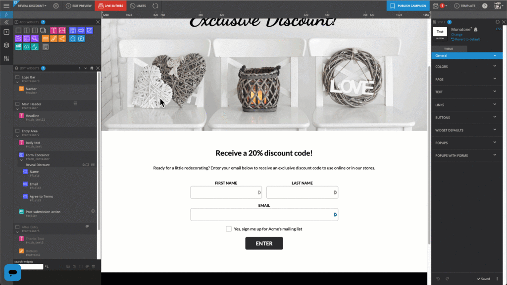
The 21st century has us a bit spoiled in the way of convenience. When it comes to online entry forms, the bar for a simple user experience has been set pretty high. This is why it’s crucial to be mindful of your form’s length. When users see what they perceive as too many form fields, it’s likely they’ll abandon it. Displaying all form fields on a single “page” perpetuates the perception that the form is too long. In fact, single-page entry forms typically only convert at a rate of 4.53%.
If you’ve already done the work of driving traffic to your online form, don’t lose out on those hard-earned conversions. Breaking up a lengthy form into multiple pages is a simple solution that I’ll talk more about later on.
Ads or Upsells
It’s tempting to advertise or upsell to a customer you already have on the hook, however, your effort to increase revenue at this stage in your sales funnel may have the opposite effect than intended. After all, 11% of abandonment is attributed to too many ads or upsells.
Solving this form abandonment issue may not be as black and white as other solutions. Before removing your ads or upsells from the equation, it may be worth doing some testing. If your ads and upsells are contributing to a large percentage of revenue than your form abandonment is causing you to lose out on, you may want to leave your form as-is.
Forced Account Creation
A streamlined buying experience is essential when working to provide a positive user experience. However, if a user’s goal is to complete an entry form, having to complete a second entry form to set up an account seems far from streamlined. Additionally, creating an account usually leads to an inbox full of unwanted emails, which can be a major deterrent for most online users. For this reason, it’s no surprise that 23% of users will not fill out a checkout form if they are forced to create an account.
Unnecessary Questions
Have you ever been trodding through a big box store when someone with a glossy badge ambushes you and asks what internet service you’re using? If you engage, you know you’ll be forced to listen to their sales pitch. Asking for data that seems unrelated to your form conversion feels similar to this, and is a quick way to tank your conversion rate. For example, 37% of users will abandon a form that asks for their phone number. Likely, because users know that providing this info will lead to receiving a phone call and sales pitch.
What are some solutions to building better forms?
Now that you have a solid understanding of the things that will make users flee from your form, let’s talk about best practices that will not only reduce your abandonment rates, but allow you to collect more data from the entrants you convert. Let’s jump right in!
Use Multi-Step (or Multi-Page) Forms
As the name implies, a multi-step form brakes up an entry form into multiple “pages” by only displaying a few form fields at a time. The fields can be grouped into sensible clusters. For example, group similar data fields together such as “Where do you live?,” “How long have you lived there?”, and, “What is your household income?” into one page.
As I mentioned earlier, breaking up the form’s fields into digestible chunks allows users to feel less overwhelmed with the number of fields in the form. Surprisingly, the average completion rate of multi-page forms is 13.85% vs. 4.53% which is the average completion rate of single-page forms. Not only does this reduce abandonment, it allows you to collect more data from form entrants.
When building a multi-step form, a best practice is to include a “back” button so previous fields can be edited at any time. Lastly, make sure to include a measure that indicates that fields are required before allowing users to move on to the next step.

Use Conditional (or Branching) Logic
Using conditional (or branching) logic can help you tailor the experience of your entry form to the individual user you’re working to convert. In this example, an interior design company uses conditional logic to tailor their line of questions based on a level of interest. Only when selecting the “we’re currently looking for a designer” option, is the user asked for their phone number and a good time to call. If they had selected any other option, the user would merely be prompted to subscribe to an email list, which will promote top-of-mind awareness until the prospect is ready to move forward with a project.
Picture this same scenario in a form without the conditional logic experience. If all form users were asked for their phone number, this could cause a significant number of users to abandon. Asking specific questions to specific users can help you gather the most data and the most useful data, all while minimizing abandonment.
https://youtu.be/GkAt68sRbx8
Make Your Form Mobile Friendly
Our phones have become a convenient window into the world. We can check emails, shop on Amazon, and read articles while sitting in the drive-thru, waiting at the doctor’s office, or ignoring a lengthy commercial break. So, it’s no surprise mobile devices see far more conversions than desktops. In fact, the average desktop conversion rate is 14% vs. 54% on mobile.
For this reason, it’s so important to design with mobile in mind. Form-building software like ShortStack allows you to optimize your form for mobile devices by simulating various screen sizes while building. You can even test your form on a real device simply by scanning a QR code.
Use Automation to Qualify Leads
Here’s a statistic that may blow your mind: companies that use marketing automation software can see a 451% increase in qualified leads.
How can this be? According to Oracle, sales reps are only following up on about 20% of all leads collected. What makes this low percentage even bleaker is that 70% of the leads followed up on are unqualified. This is not meant to throw shade at sales reps. After all, they can’t be following up on leads 24 hours a day. But what if your lead collecting entry form was merely the first step in an automated qualification funnel that allowed your sales reps to focus on the leads most likely to convert? Odds are, you would start to see a huge boost in conversion rates.
To build an automated sales funnel, you’ll need to use form-building software that supports integrations. Then, use third-party integration platforms such as Zapier allow for any non-developer to set up communication between your entry form and a CRM, email marketing platform, or potentially any platform in your martech stack.
Bonus tips for increasing form conversions
Sometimes, the simplest things can make a big impact. In this list of tips, learn a few simple-to-implement ways to boost conversions even further.
Use a Call-to-Action
If your entry form’s submit button says “submit”, you’re missing out on a valuable opportunity to use a call-to-action. A call-to-action is more than a directive or direction. It is defined as “an exhortation or stimulus to do something in order to achieve an aim or deal with a problem.”
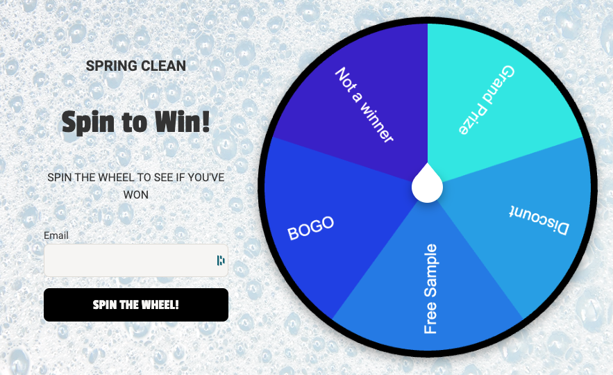
Although short and seemingly trivial, calls-to-action can be the nudge needed to inspire form visitors to convert. Instead of using the words “submit” or “enter”, test CTAs relevant to the purpose of your form such as, “enter to win!”, “send my discount!”, or “sign me up!”
Test Your Form Placement
There is a strong argument that placing your entry form above the fold of the screen will result in more conversions. According to the Neilson Group, 84% is the average difference in how users treat info above vs. below the fold. But there are other factors that play into above vs. below the fold results as well. Some of these factors include copy, CTAs, and other UX elements displayed on your page.
Instead of taking the above vs. below the fold data at face value, it’s always important to split test your page to verify what works best. This anecdote of Neil Patel’s reminds us why when describing a case where placing the form below the fold resulted in 220% more conversions.
Use Immediate Validation
When requiring form fields, immediately allowing users to see if the field data is not valid can increase conversions over the alternative method - showing all field errors after the user clicks the submit button. If the form-building software you’re using doesn’t allow for immediate (or, in-line) validation, especially within a lengthy entry form, breaking up the form into multiple “pages” will help you show these errors over short sets of form fields.
Use Progress Indicators
Have you ever reluctantly agreed to take a survey and bailed in the middle of it because you were beginning to think it would never end? Progress indicators offer a welcome bit of transparency to the person filling out your form. These progress indicators can be small text indicating how many steps are left to complete the form. Other popular types of progress indicators are displayed as progress bars.
Key Takeaways
If you’re looking to boost conversions in your online entry form, it’s important to first understand why users abandon forms in the first place. A few of the major reasons include concerns over data security, a form that is too lengthy, too many ads or upsells, or including fields that ask unnecessary questions.
With this in mind, learn the ways to build your entry form with conversion optimization in mind. Break your form up into multiple sections in a multi-page form, when doing so, use progress indicators to let the user know how many more steps they need to complete, as well as immediate validation to keep users from having to go far back in the form to correct field errors. Use conditional (or branching) logic to allow you to collect the right data from the right prospect, every time.
Once your form is built, make sure it’s mobile-friendly. Configure integrations to automate qualifying leads. Lastly, test the placement of your form to make sure you’re capturing the most attention.
For an easy-to-digest summary of this article, check out this infographic: 6 Ways to Reduce Form Abandonment.

:format(webp))
:format(webp))
:format(webp))