How to Create Designer-Quality Images for Free
Learn how to create designer-quality images even if you're not a designer with these six helpful tips and a recommended tool.
Confession time: I am not a designer. Actually, I have very little experience using photoshop or any other professional design tools. That said, I still want to create designer-quality images quickly and on my own. Sounds like wishful thinking, right? Wrong! Nowadays there are lots of online tools (most of which are free!) that make it easy for non-designer folks to create beautiful, professional-looking images.
But here’s the catch: Even with a great tool, it’s still important to have a few core design tips under your belt. In today’s post I’m going to share with you six tips that will help you dramatically increase the quality and look of the images/graphics you create for your blog, social media posts, and more.
My Tool of Choice
After testing out a handful of online design tools like PicMonkey, Skitch by Evernote, and a couple others, I decided Canva is my tool of choice. Hey, if Guy Kawasaki is willing to back the brand, I’m confident it’s a top-notch tool for marketers, like myself, to use. ShortStack also recently integrated with Canva so I’m particularly fond of the product.Although I like to use Canva, you don’t have to. All the design tips I’m about to share apply no matter what design tool you use.
Tip #1: Choose an Image that Does Not Look Like a Stock Photo
Let’s start with the obvious: A Google image search is not the correct way to find a photo. There are millions of fabulous but copyrighted photos on the web. Using one could get you in legal hot water. If you have a generous budget for buying high-quality photos, lucky you. But if you have a limited budget and can only use inexpensive stock photos, it might be challenging to find unique, well-made images. So how do you find great images that don’t look like standard stock photos without draining your entire budget on a single shot? You can thank Medium’s product designer Dustin Senos for the answer to this question.
In January, he compiled a great list of sites to where you can find the best free stock photos.
Here it is:
• Death to the Stock Photo http://join.deathtothestockphoto.com/
• Little Visuals http://littlevisuals.co/
• Unsplash http://unsplash.com/
• New Old Stock http://nos.twnsnd.co/
• Superfamous (requires attribution) http://superfamous.com/
• Picjumbo http://picjumbo.com/
• The Pattern Library http://thepatternlibrary.com/
• Getrefe http://getrefe.tumblr.com/
• IM Free (requires attribution) http://imcreator.com/free
• Jay Mantri http://jaymantri.com/
• Magdeleine http://magdeleine.co/
• Foodiesfeed http://foodiesfeed.com
• Picography http://picography.co/
A site I recently discovered, which Senos didn’t feature on his list, is Stocksy. I searched for “desk” and found so many inspiring images that turned out to be just what I had in mind. Pikwizard.com is another site that offers over one million stock images, 100,000 of which are free.
The lesson for this tip: Even if you have a stock photo budget, get crafty with the way you use it! There are lots of places on the web you can find quality photos that won’t bust your budget. Save your big image purchases for your website and pull from the sites listed above for your daily social media and blog post images.
Tip #2: Use More Than One Font
Once you’ve found a great image to work with, you’re halfway there.
Now comes the tricky part: adding text and editing the image (which I’ll cover in tip #5). First, the text. One mistake lots of people make is sticking to just one font. When you have a lot of text you want to feature on your image, or you want to emphasize certain copy, mix and match your fonts. Using a variety of fonts will make your image much more interesting.
Important note: Not all fonts work well together!
Tip #3: Choose a Complementary Color Palette
If you’re creating an image from scratch (without a base or background image), there will be a lot riding on the color palette you choose, as it will be the focus of your design. It may seem easy, but choosing the right complementary colors to pair together takes some planning. Thankfully, there’s Colourlovers. Colourlovers is a creative community where people share colors, palettes and patterns with other designers, even amateurs like me. If you browse for a few minutes, you’ll see examples of colors that work well together and will capture whatever mood or style you’re trying to convey. You can search by channel, e.g., “Business,” “Print,” or “Web,” or by trend, e.g., “Handmade,” “Street fashion,” or “Wedding.”
Bonus: All the color palettes and patterns on the site are free to use!When choosing your color palette, keep contrast in mind. Zach Kitschke of Canva explains that using contrast helps your designs stand out. “Make sure you use contrasting colors, particularly when choosing your background color and the color of any fonts or graphics you use in your design,” he says. “A good rule of thumb is if you have a light colored background then you should use a dark font (and vice versa).” Solid tip, Zach!
Tip #4: Create Color Blocks for Text
When you’ve found a great image to use for the base of your graphic, create a shape on top of it to display text. Not sure what color to make your shape? Poppie Pack, Canva’s Senior Graphic Designer, suggests finding the dominant colors in your image, and applying them to your shape and text to create aesthetic cohesion. You can see she how pulled the color she chose for her block shape from the seeds of the kiwis and the green color she chose for her text from the color of the fruit.
Tip #5: Soften Your Background Image
When you have text you want to feature on a competing image (an image with minimal white or clear space, like the one I used for my “desk” example image), soften your image by blurring it or decreasing its transparency. When you do this, your text/message will be front and center.
Tip #6: Keep it Simple
In design, less is more! Just like Coco Chanel’s attitude toward jewelry. She famously said, “Before you leave the house, look in the mirror and take one thing off. ” The same idea can apply to design. Before you decide you’re finished with your image, look at it and ask, “Can I subtract anything?” If you can, do it.
The Final Product
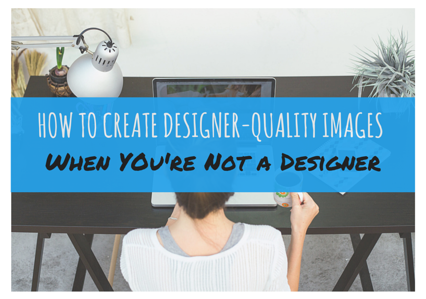
Of course I had to put my money where my mouth is. Keeping all six tips in mind, here is a blog post image I created using Canva.
Step by step, here’s how I created this image, using Canva:
1. I uploaded the image I bought from Stocksy.
2. To create a color block for my text, I used Canva’s free "A Text Block" graphic and changed its color to blue.
3. The fonts. Oh, boy! I spent quite a bit of time deciding on my two types of text. The top text is called "Amatic Small Caps" and the bottom is called "Permanent Marker." I like the lower text a lot because it looks like an amateur's writing. And since the blog post topic is aimed at amateur designers, I think the mood of the text font works.
4. I decreased the transparency of my background image to 82 to make my blog post title pop more. Viola! Image complete. Have you ever created or edited an image using Canva? If you have, I'd love if you'd share with me your design tips in the comment section below.
Happy designing, Canva lovers!
![Your Guide to Facebook and Instagram Contest Rules 2022 [TEMPLATE]](https://cdn.shortstack.com/website/blog/social-media-contest-rules-template/68b0e4bd0eaeb3b4049ada0c_653795a0ebd89670540de484_fb-ig-rules-featured.png)