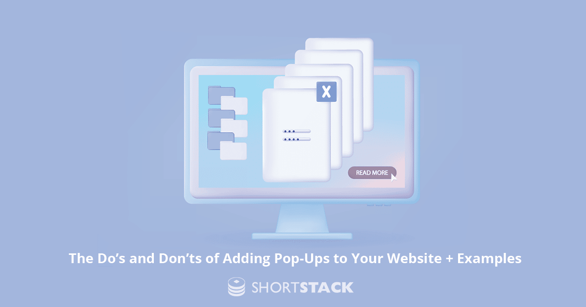
The Do’s and Don’ts of Adding Pop-Ups to Your Website + Examples
This content discusses the best practices for using pop-ups on websites, including dos and don'ts and effective strategies.
It’s 9 o’clock at night on a Thursday, and you are sipping some tea - or maybe wine if it has been a rough day - and casually shopping on your favorite website. You start to yawn and figure it’s time to get ready for bed. Just as you are about to close the tab, BAM! An exit intent pop-up shows the following message, “Wait! You have items in your bag.” A call to action prompts you to “check out now,” and you end up purchasing a new purse.
We’ve all been there because those darn exit intent pop-ups work. In fact, exit intent pop-ups have a conversion rate of about 3 to 5%. While not a huge number, it’s still enough to help increase your leads, sales, and site interactions with zero developer time. Pop-ups are standard practice on websites, but do you know the best do’s and don’ts when adding one to your own site?
Don’t cram in too much information.
As a general rule of thumb, pop-ups should not exceed a max width of 900 px. If you use an image, that doesn’t leave much space for content so make sure to get creative.
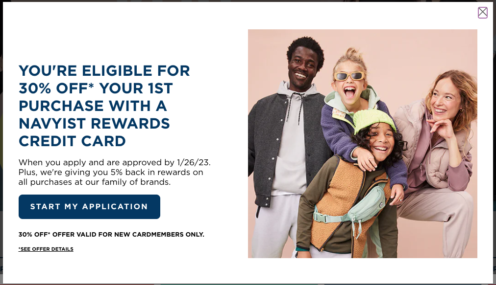
Old Navy uses its pop-up to encourage customers to apply for their credit card. They have included some informative copy, and the call to action (CTA) button leads customers to the application. This is a simple yet effective pop-up example.
Do collect user information.
Collecting emails so you can send future communications is a great way to stay top of mind with your new and existing customers. You can collect email addresses for a newsletter or offer a coupon code.
You don’t need to build a huge form. In fact, just an email field is sufficient. If you want to personalize your emails, you can add a name field. If you need to gather more information from the user, do so later. Your window of time for this interaction is just enough to show the visitor the information they want and collect the lead information you need.
Tip: if you don’t want visitors to guess the classic “Welcome10” as your 10% off code, use custom codes instead.
Don’t overwhelm your audience with too many pop-ups.
Be mindful of your users’ experience as they navigate through your site. Creating a bump in your visitors’ journey with an unwanted pop-up can be detrimental. For example, I was looking at rugs recently and witnessed an interruption while browsing products. Every time I clicked to view the next page of products, I saw this pop-up and had to decline it before I was able to continue my search.
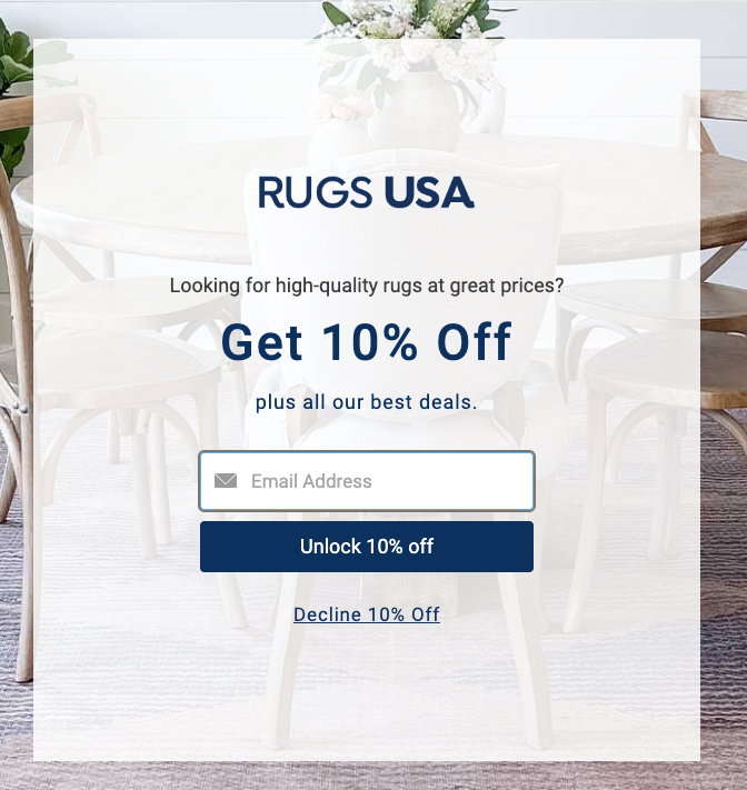
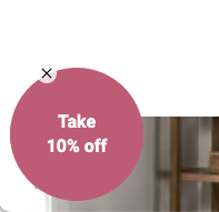
Thankfully, they improved their user experience (UX) with this small circle so the pop-up would expand, but only if I chose to click it. Another way of improving this pop-up would be to only show it once a customer has added an item to their cart.
Another poor example is NFL’s double pop-up display.
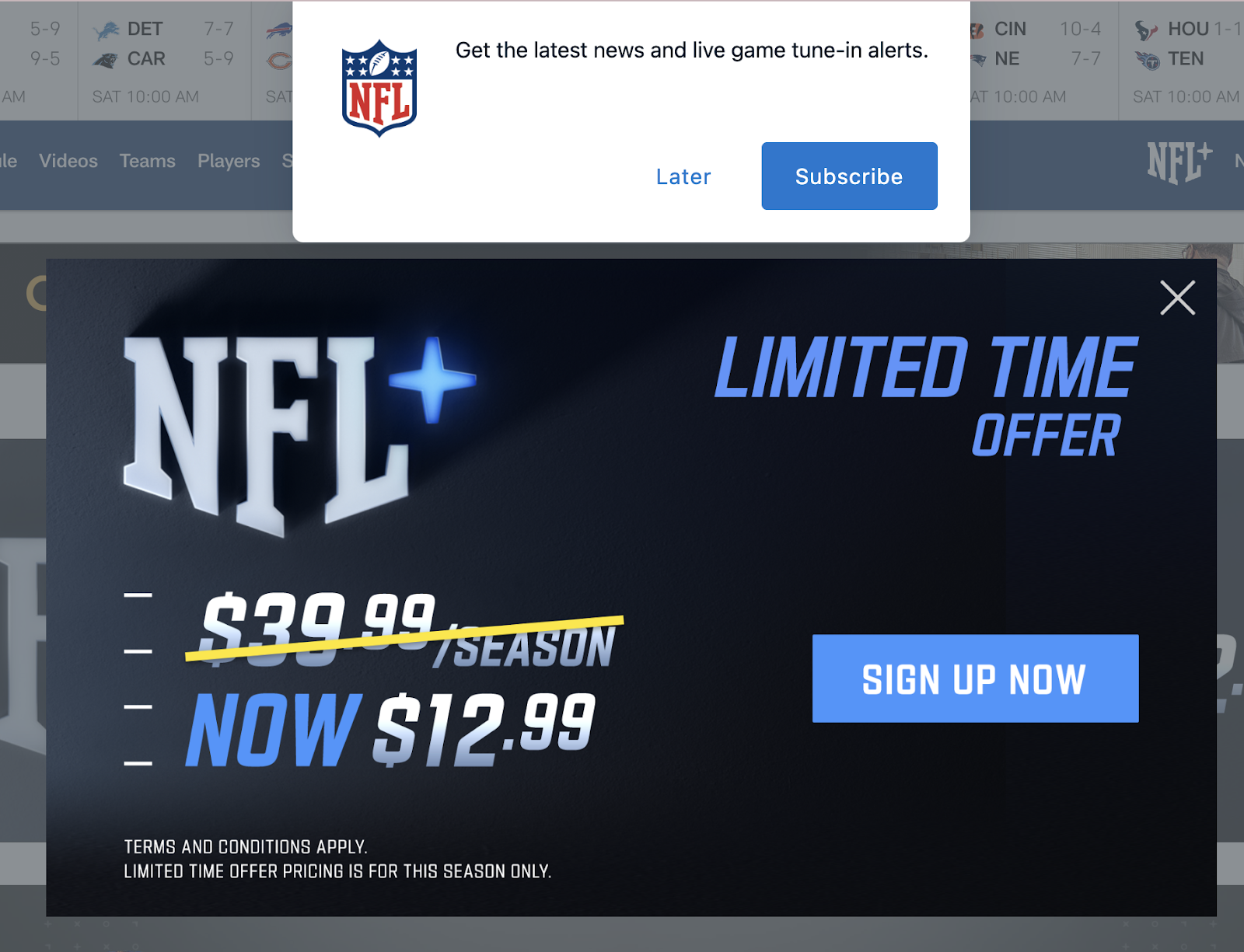
Showing two pop-ups at once is overwhelming. When I clicked on “later” for the browser notification pop-up, the limited-time offer closed as well, so my opportunity to sign up was removed. Stick to one pop-up at a time, or in this case, use a timed pop-up. That way the first-time visitor has the opportunity to see and contemplate one option at a time.
Keep reading for more information about using timed pop-ups.
Do offer coupons in exchange for emails (leads).
Going back to collecting leads, gathering information from your visitors should be rewarding. Most consumers want something in return, whether it be access to a monthly newsletter or a small discount on their first purchase. You can even have users sign up for your rewards program. Offering a coupon or exclusive content for an email and name is an easy exchange and bulks up your leads for future marketing campaigns.
Do grab visitors' attention through color and timed pop-ups.
Pop-ups are meant to grab your audience’s attention, right? Therefore, make your pop-up stand out by using a complementary color. Take a look at a color wheel and find a color that complements your main color scheme. Don’t make your pop-up too distracting, but if it is a small notification, you will want it to stand out on the page that your visitor is viewing.
Additionally, using a timed feature to show your pop-up after a user has been on the site for a certain amount of time can help refocus their attention and keep them on the right path.
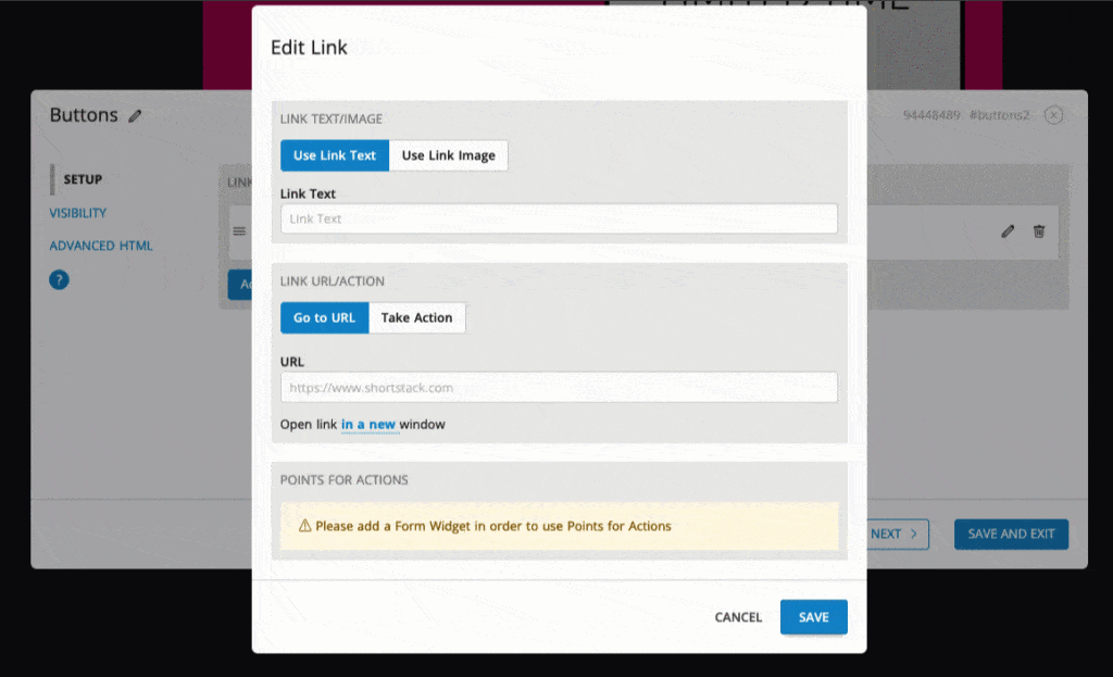
For example, when you are filling out an application and you get distracted, you may see a pop-up similar to the one below.
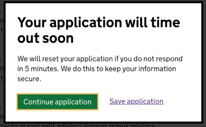
This notification not only reminds the user to redirect their focus back to the application, but it also presents a sense of urgency in completing it. Ultimately, using a timed pop-up can keep your website visitors on the path you expect them to take and finish their application, purchase, or form submission.
Don’t forget to add the option to close the pop-up.
Be clear about how a site visitor can close a pop-up to avoid confusion. The worst case scenario: a visitor closes the tab completely and never returns to your site. Yikes. No one wants that, especially in the business of customer service, retention, and sales.
Use ShortStack’s Action Widget to create a close pop-up action. Some great text to use for the visitor to close the pop-up are:
- Decline offer
- Close
- Next time
- Remind me later
- No thanks
- Thanks for the information
Do use pop-ups to age-gate your site or specific products.
Do you sell products such as nicotine or alcohol that require the purchaser to be a certain age? Use an easy pop-up like Rogue Brewery’s to make sure the content they see is age appropriate.
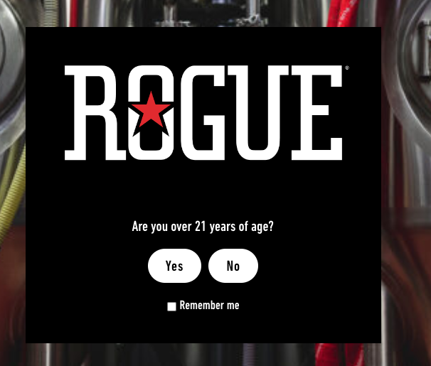
You can use a pre-made template like this one to ensure visitors are of the correct age to enter your site.
Do inform your customers of major changes.
When you are releasing new products or services and want to get that information in front of your users, the best way to inform them is through a pop-up. When we have a new template, feature, or major update to our Campaign Builder, we inform clients via in-application pop-ups such as the one below.
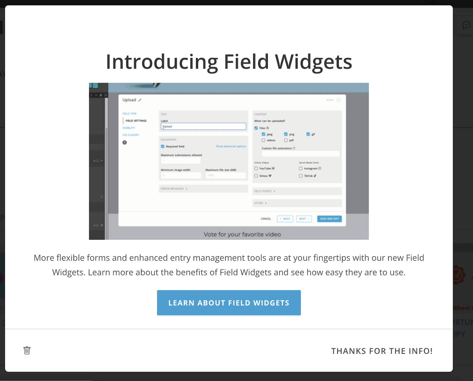
Anyone looking for more information on this new feature can click the CTA button for a more in-depth explanation. Likewise, if the client doesn’t want to learn about the feature or already knows the information, the option to close the pop-up is clearly listed in two places: the trash can icon and the “Thanks for the Info!” option.
Conclusion
All in all, pop-ups are an incredibly successful marketing tool. Whether you want to inform website visitors about a new change or you want to collect some leads for future marketing campaigns, try using a pop-up. Refer to the above-listed do’s and don’ts to help reach your business goals for 2023.
:format(webp))
:format(webp))