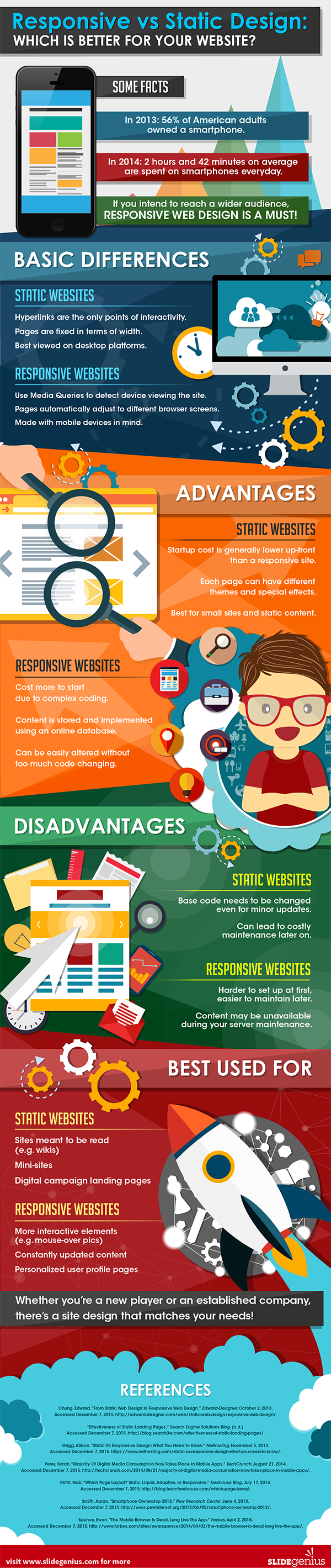
What is Responsive Design and Why Does it Matter? [Infographic]
This content discusses the importance of having a responsive design for your website and how it affects SEO rankings.
Dana Kilroy · · 1 min read
![What is Responsive Design and Why Does it Matter? [Infographic]](https://cdn.shortstack.com/website/blog/what-is-responsive-design-and-why-does-it-matter-infographic/68b0e4c7eab87d3e6b2277ab_6537a5284c31261578ecdb1a_shortstack-blog-responsive-design-infor.jpeg)
Did you know that if your website doesn't have a responsive design -- meaning the content doesn't adapt to a variety of screen sizes -- your SEO efforts could be affected.
It's true: Google takes responsiveness into account when it ranks your pages. And now that 50 percent of Google's searches come from mobile devices, responsiveness isn't just nice to have, it's a must. Today's infographic, from Slide Genius, looks at some of the facts related to responsive design and search. Let us know @ShortStacklab if this infographic has made you rethink your website's design.