9 Contest and Landing Page Design Tips for Non-Designers
Learn how to design like a pro with these nine tips, including using templates, simple tools, hierarchy, and negative space.
Remember when your parents and teachers told you “you can be anything you wanna be”? In a way, that’s especially true today. In this information age, we can learn just about anything - it just takes some time to digest a few “how to” articles and YouTube videos. This isn’t to say you can learn to be a surgeon, or even change careers based on a bit of internet research, but you can certainly learn some new skills. If you want to be a better writer, learn to juggle or tile a bathroom floor, Google can teach you.Improving your graphic design abilities is one of those things you can do with the resources available to you online. Although a professional graphic designer is crucial for certain stages of developing your brand, you don’t want to rack up a ton of billable hours having them do everyday design nitty gritty. For example, when building a contest, giveaway, or landing page, use these few simple design principles and tools at your fingertips to help you make it look as stunning as any pro designer could. Learning some DIY design skills will save you money, time and keep your professional graphic designer focused on the tasks out of your skill-set scope.Here are nine tips to help you design like a pro.
1. Start with a template
Templates are designed by professionals, so using one will help make your design look like it was created by a professional. Use the layout in a template as a guide to build your contest or landing page. Templates come with other benefits as well - they alleviate any anxiety that comes from starting with a “blank canvas” to save you time. As a bonus, perusing a gallery of templates can help you brainstorm new ideas.
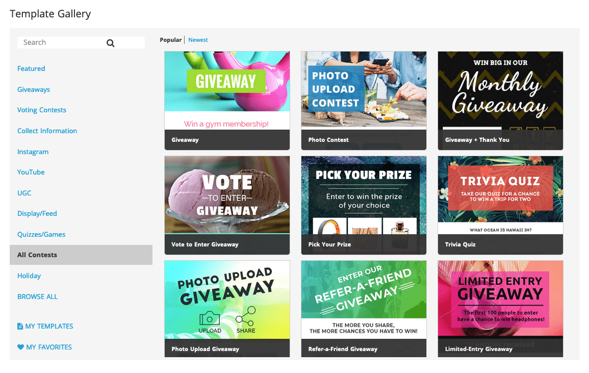
ShortStack's Template GalleryIf you’re looking to build a contest or landing page, contest builders like ShortStack offer dozens of templates to help you get started on the right foot. Most importantly, using one of these templates doesn’t confine you to the parameters of the template. ShortStack’s templates, for example, are 100% customizable.
2. Use simple tools
For many, design can feel like an out-of-reach skill set because designers typically use robust software programs like Illustrator or Photoshop. When creating your design, you may not be ready, or have the time to learn a platform like this. Not to worry! There are other, simple tools available for non-designers like you and me. Canva, for example, makes it simple to overlay text on graphics for professional looking headlines and hero images.There are a number of simple, easy-to-use tools out there for non-professionals. Here are a few more.
3. Use hierarchy
In design, hierarchy is the order in which you present your information as well as how it’s displayed. Creating a hierarchy is important because it helps to visually guide the user through the text in your contest or on your landing page. For example, a typical hierarchy includes a headline or hero image at the top of the screen. This is the title of your page and will announce what to expect. For example “2019 Vacation Giveaway” or “Win a Trip to the Bahamas.” Use this snippet of text to capture the attention of the reader.Then, below the headline is the subheader. Since your headline should be short, the sub header can give a little more detail in reference to the headline. For example, if your headline is “Win a trip to the Bahamas,” your subhead can elaborate with something like “Enter to win a romantic trip for two plus other great prizes.”

Use hierarchy in your typography
4. Don’t use too much text
For non-designers, this is a tough one. Our instinctual urge is to sell, sell, sell. Therefore, the more “selling” we can do in a space (with words) the better, right? Actually, too much text can have the opposite effect of hooking a reader. Instead, it can overwhelm the brain. Ever heard the expression TL;DR (too long, didn’t read)?Keep your CTAs (calls to action) short and or your paragraphs small. You can go nuts when it comes to writing rules or terms and conditions because those can easily be hidden behind a link and displayed in a separate popup. But when it comes to the prime real estate on your landing page or contest, the best practice is to keep it short and sweet.
5. Don’t overuse fonts and colors
I get excited looking through fonts. Maybe a bit too excited. So, unless you’re a true pro and know what you’re doing, make sure to limit your fonts to two or three at the very most.Much like text, too many fonts can overwhelm the brain and cause confusion. Not to mention, they can clash like floral curtains against plaid wallpaper. In fact, the use of fonts may be one of those things you leave in the capable hands of your professional graphic design. In other words, stick with the fonts that are already used in your branding. This is a great segue into the next tip...
6. Mirror your brand
There’s a reason you spend a lot of time and hard work building a reputable brand. Although a landing page or contest may not be a mainstay on your website, mirroring the design elements of your brand (logo, fonts, color palettes as well as keywords) will help you maintain an appearance of professionalism and also help instill trustworthiness.This is especially true when asking for participants and visitors to submit their personal info into an entry form - by mirroring your company’s brand, the landing page or contest becomes trustworthy and encourages more entries.
7. Readability > pretty
Even the pros can be guilty of this one. Sometimes, a design looks really cool, but at the expense of being legible. Here’s an example:
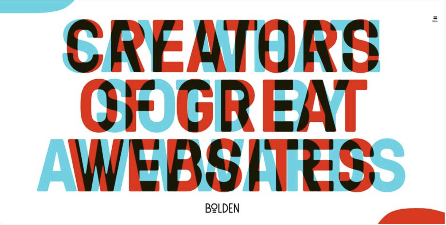
Don't sacrifice readability for cool designMake sure you’re favoring legibility over design. A visitor’s interest in your campaign can be a fragile thing so make sure the message you’re delivering is as clear as possible without making visitors struggle to read.
8. Embrace negative space
Negative space is the solid or “empty” space around an image or text. Pay attention and you’ll start to notice negative space used in design just about everywhere you look. Many major brands embrace the power of this all-too-important design principle because its genius is twofold: negative space draws the eye to a focal point, putting emphasis on something deemed important, and also creates a clean, ultra-professional looking design.
Negative space helps emphasize your message
9. Test, test, test
Testing what you build is often an overlooked step, but an incredibly important one. There are so many factors to consider that may not be obvious to you when building your campaign. First and foremost, what does your contest or landing page look like on a mobile device? Or a tablet? It’s important to test browsers, devices, and functionality to ensure a smooth user experience after launch. To make sure you’re sufficiently kicking the tires, here are some best practices for testing what you’ve built.To go a step further, you can even A/B test elements within your campaigns to help you identify your best-performing content. Then, use it when building future contests and landing pages. A/B testing is when you create more than one version of the same landing page. With contest building platforms like ShortStack, you can build multiple versions of a campaign that are connected to the same entry form. This means, no matter which version of the campaign the user sees, the entry will be collected into the same list, making it simple to choose a winner or build one email list, while simultaneously seeing which version of the campaign performed the best.There’s an element of design no article or YouTube video can teach you. Good design also comes from experience - as a human living on planet earth, you’re immersed in a world of examples, and witness both great and ghastly design every day. So, follow these basic principles, but also go with your gut. Even the best professional designers will sometimes design by the book of “because it looks cool” so have some fun and go with what feels right.
Create your first contest now
Get Started Today. It’s free and we don’t need your credit card.