SNEAK PEEK: Get a First Look at Facebook's New Pages Layout 2016
Facebook Pages layout has been updated with changes including new dimensions for profile picture and cover photo, and moved buttons.
Updated as of August 9th, 2016
Facebook is at it again, making bold changes to the Facebook Pages layout.We first noticed the changes last month (July 22, 2016) and immediately realized that Facebook is rolling out these changes a little differently than normal. Often, when Facebook debuts a new design, they do it page by page, but it appears that this time around Facebook rolled out the changes on a user by user basis.As of today, it seems that all Pages have the new layout (personal profiles haven't changed yet).
According to Facebook's Help Center, here are the new dimensions for Pages, for other details about the update and what has changed, scroll down:
• Page Profile Picture, will be cropped to fit a square: 160x160 pixels.
• Page Cover Photo: displays at 828 pixels wide by 315 tall on desktops and 640x360 on smartphones (must be 399x150).
• Images Load fastest as n sRGB JPG that's 851 pixels wide and 315 pixels tall (and less than 100 kbs).
Here's what we're looking at today:
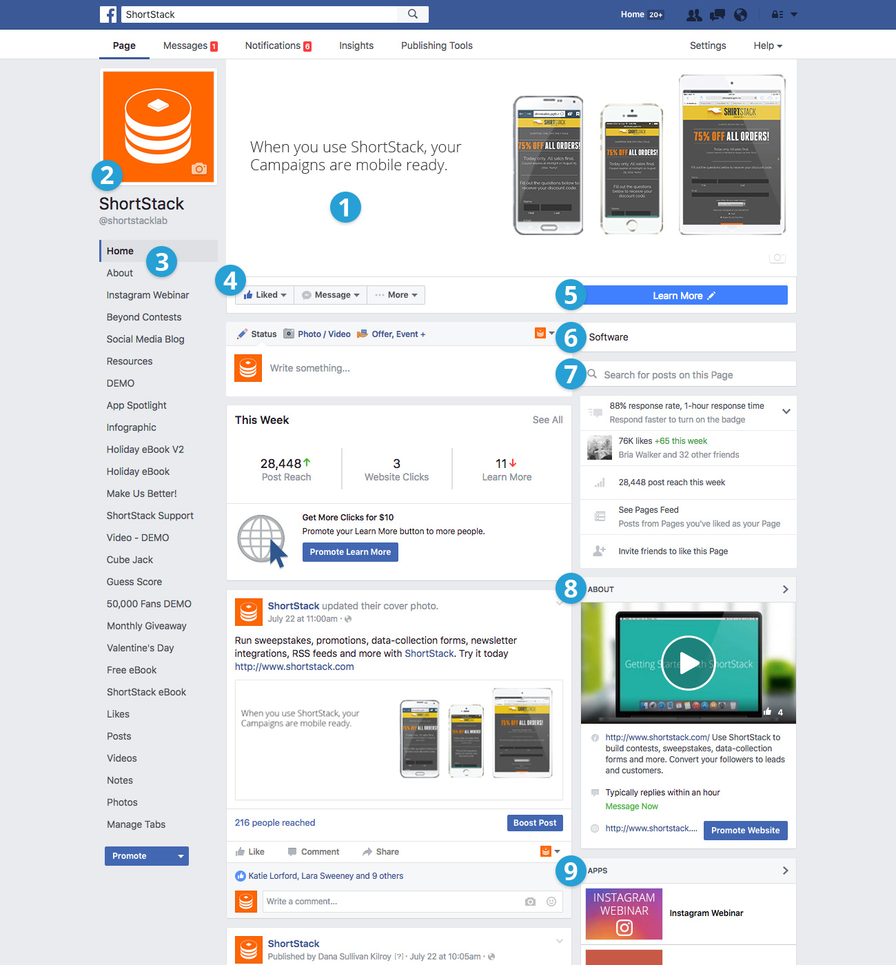
1. Cleaner cover photo
On on new view, Facebook has removed the logo from the cover image territory. For inspiration on creating an awesome cover photo, check out these 25 ways to make a statement with your cover photo.
2. "Logo" image has moved to left-hand column
On the ShortStack Page, the logo is also slightly bigger than it was before (though we were able to reuse an existing image without any issues)
3. More Page Tabs are visible
Page tabs appear under the logo, and on our page, every single tab was listed (we have since removed a few!).
4. Like, Message and Share Buttons have moved
Along with the page tab links, the "Like, Message and Share" buttons have also moved underneath the cover image, positioned to the left.
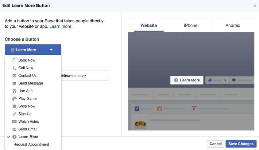
5. Call-to-Action button is bigger (and has moved)
Perhaps one of the biggest, and most exciting changes is that the call-to-action buttons have moved and are more visible. Call-to-action buttons on the new layout can be found underneath the tab links. The CTA button includes, "Book now," "Call Now," "Shop Now," "Watch Video," "Request Appointment," and "Send Email," plus a few more.
6. Business categories are more prominent
Businesses can choose from one of 27 categories.
7. The search bar lets you search for posts from the page
8. The About section appears on the right
The "About" section used to blend in with other callouts for Videos. Now it's in its own category on the right-hand sidebar. Ours includes our getting started video.
9. Your most important apps appear on the right, with images
While there is a long list of tabs/apps listed on the left, the three that you want to highlight are listed on the right. Okay, those are the highlights. Keep an eye on this post and as soon as we learn more, we'll give you the scoop.
:format(webp))
:format(webp))
:format(webp))