Mobile best practices
Follow these tips to ensure your campaign looks great on mobile devices without needing extensive CSS tweaking.
Use the Image Widget when possible
The Image Widget automatically scales large images (including hotspots) to fit screen sizes.
Note: Small hotspots will become even smaller on mobile devices due to scaling.
Background images do not Scale
Avoid using background images for content containing vital information. Background images are not automatically scaled and may get cut off on devices with smaller resolutions.
Alternative Solution: Use Image Widgets, which automatically scale to fit mobile devices.
Using the CSS Background-size Property
Most modern browsers support the background-size property, which can scale background images. Keep in mind, this property does not work in older browsers.
Example CSS
To resize all widget backgrounds, add the following to your Custom CSS:
<code class="language-css">body.mobile.ss_box {
    background-size: 100%;
}
/* Remove 'body.mobile' to apply this to desktop campaigns as well */
</code>
Use percentage instead of pixel dimensions
Avoid pixel-based dimensions for padding, margins, and absolute positions when designing for mobile. Pixel dimensions work for fixed-width designs but not for responsive layouts.
Instead, start with pixel dimensions during initial design, then convert them to percentages for better responsiveness.
Example
Instead of:
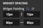
Use:
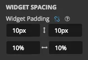
This scales the side padding proportionally across devices while keeping the top padding fixed at 10px.
Hide/show widgets at specific screen sizes
Steps to configure visibility in the Style Panel
- Select the widget or container you want to configure.
- Ensure you are in the "This 'Widget'" tab of the Style Panel.
- Open the Widget section and locate the Widget Visibility options.
Visibility options
Hide Widget At This Width or Less:
- Hide the widget on smaller screens (e.g., mobile devices).
Hide Widget At This Width or Greater:
- Hide the widget on larger screens (e.g., desktop).
Example
To display a widget only on phones, use the Hide Widget At This Width or Greater option and select the middle size.
Overriding the viewport Meta tag
By default, ShortStack includes the following meta tag to optimize campaigns for mobile browsers:
<code class="language-auto language-html"><meta name="viewport" content="width=device-width, maximum-scale=1">
</code>
If you’re familiar with the viewport meta tag, you can override this default setting:
- Add a new meta tag to a Code Widget in your campaign.
- Customize the tag as needed for your campaign’s requirements.
Related resources
How to Work with Background Images (Video).
Tips for Designing Mobile-Friendly Landing Pages (Blog).
Was this helpful?
Thanks — that helps us decide what to fix next.
Sorry this missed. Tell us what you needed and we'll get you an answer — and fix the page.